In the previous chapter, you learned about fundamental analysis, which involves inspecting company finances. We’re now shifting into a different type of analysis.
Technical analysis involves identifying and predicting trends in the stock market. Technical analysts typically pay little-to-no attention to the fundamentals of a company (e.g. expenses, revenues, etc.). They’re more concerned with finding predictable stock price patterns and betting on those patterns occurring again.
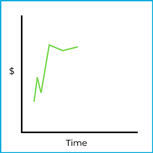
Technical analysts believe history repeats itself in the market. To better understand this, let’s look at a stock chart:
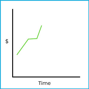
While this may look like a basic stock chart, a technical analyst would identify this as a unique formation. Specifically, this is a head and shoulders bottom formation. While the stock’s market movement already played out with the chart above, it could be used to predict where the stock price goes in the future. For example, what if a few days later the same stock started fluctuating like this:
While there’s no promise the market price will move in the same direction, there is some evidence of repeating market trends in the real world. If this stock follows the same trajectory as it did previously, a purchase at this point would be profitable:
Again, the market is unpredictable and could easily go the other way. Technical analysis is a prediction tool, but not all predictions come true. It takes a fair amount of chart analysis to find these trends, which is why technical analysts are sometimes referred to as “chartists” (chart artists).
Saucer formations are market trends that include a reversal. There are two types of saucer formations: saucer bottom formations and saucer top formations.
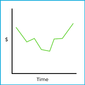
A saucer bottom formation looks something like this:
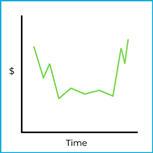
It kind of looks like a saucer (bowl), right? Technical analysts try to identify trends like this, which help them predict future market movements. While the stock price started and ended in the same general area, the stock is moving upwards after bottoming out. This is referred to as a reverse downward trend. The stock price was moving down, then reversed back upward.
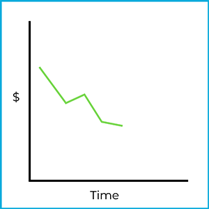
Technical analysts are on the lookout for the beginning of a saucer formation. For example:
If a chartist identified this as the beginning stage of a saucer bottom formation, they could make a quick profit by going long (buying) the stock at this point:
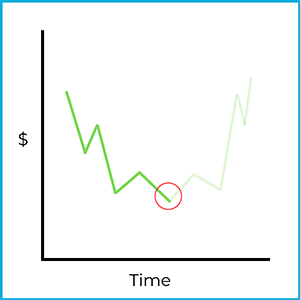
Of course, the market is unpredictable and could move in a different direction. However, the market does trend in a predictable fashion from time to time. A confident technical analyst making an investment would be taking a risk, but the risk could pay off.
If you were to flip the previous stock charts upside down, you’d have a saucer top formation. It looks like this:
Kind of like an upside-down saucer (bowl), right? The market was trending upward, flattened out, then reversed back downward. This is an example of a reverse upward trend. Chartists keep an eye out for the initial stages of a saucer top formation.
If properly identified as the beginning of a saucer top formation, an investor could make a quick profit by going short (short selling) the stock at this point:
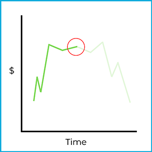
Again, the market is unpredictable and could move in a different direction. A confident technical analyst making an investment would be taking a big risk (selling short comes with unlimited risk), but it could pay off. If the trend continued downward beyond this chart, the investor would make a significant profit.
Head & shoulders formations are market trends that include a reversal, like saucers. There are two types of head & shoulder formations: head & shoulders top formations and head & shoulder bottom formations.
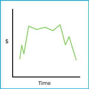
A head and shoulders top formation looks something like this:
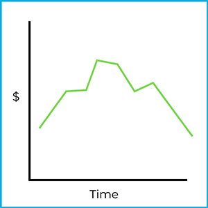
Hopefully, you see a basic outline of a person. A head & shoulders top formation rises, flattens, rises again, flattens again, falls, flattens one last time, and falls again. Initially, the stock price was trending upwards, but then it reversed at the top and moved back downward. This is an example of a reverse upward trend.
Technical analysts are on the lookout for the beginning of a head & shoulders formation. For example:
It may not look like much, but a skilled technical analyst may pick this out as the beginning of a head & shoulders top formation. If they are correct, they could make a return by going short (selling short) the stock:
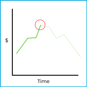
Borrowing shares and selling them at this point could return a large profit, although the investment is subject to considerable risk. Short selling (discussed in detail in a future chapter) subjects investors to unlimited risk potential! Stock movements are never 100% predictable, but a confident chartist might pull the trigger and short the stock at this point. If the market trends in the expected direction, a large profit could be made!
A head & shoulders bottom formation is basically an upside version of a top formation:
Does it look like a person hanging upside down? A head & shoulders bottom formation falls, flattens, falls again, flattens again, rises, flattens one last time, and rises again. Initially, the stock price was trending downwards, but then it reversed at the top and moved back upward. This is an example of a reverse downward trend.
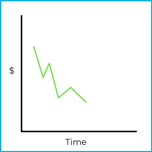
Chartists watch the market for the initial stages of head & shoulders formations:
An experienced chartist may identify this as the beginning of a head & shoulders bottom formation. If they are correct, they could make a profit by going long (buying) the stock:
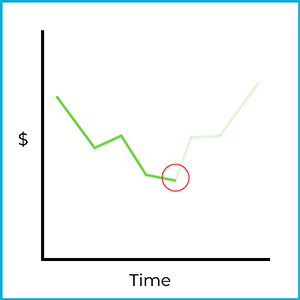
Again, stock movements are never 100% predictable, but a confident technical analyst may buy a bunch of stock if they spotted this trend. If they’re right, they can make an unlimited return the further the market rises.
A market trend offers insight into the general direction of the market. On any given trading day, market prices go up and down throughout the day. However, trend lines can be drawn through a “big picture” perspective.
Although this chart shows market movements up and down, the stock is definitely trending upwards. If this was a stock chart over the course of a month, the market was bullish over that timeframe. Temporary declines always occur in bull markets, but a high-level view would accurately describe this as a rising market.
One way to draw a trend line is through a moving average. For example, the 100-day moving average calculates the average price of a stock over the past 100 days. As time is always moving forward, new data continually affects the average. For example, the closing price of a stock today will be factored into the 100-day moving average, while the closing price of the same stock 101 days ago will fall off (no longer factored into the average).
Trend lines and moving averages are also drawn for bearish markets. There are several movements upward, but market values are generally falling over this period of time.
Trends can be found with charts, but also with number-based data. The S&P 500 is an index of 500 large publicly traded companies in US markets. The general direction of the market can also be found through the advance/decline line. For example:
S&P 500 stocks
Date | Price increases | Price decreases |
---|---|---|
Monday | 425 stocks | 75 stocks |
Tuesday | 375 stocks | 125 stocks |
Wednesday | 350 stocks | 150 stocks |
Over a three-day period, there are more stocks going up than down on any given day. You can safely assume the market is rising with the data provided. This is called market breadth, which refers to the general direction of price movements. The breadth of the market is currently bullish (increasing). However, it’s clear the market is moving towards bear territory. There seems to be a reversal occurring as more stocks are decreasing every day. This is referred to as an overbought market.
An overbought market occurs when the overall stock prices are increasing, but are moving towards a market decline. In chart form, it could look something like this:
While the market is still going up, it’s not rising as much as it was in the past. If the trend continues, eventually more stock prices will fall than rise, leading to an overall market decline.
Let’s look at the advance/decline line from the other perspective:
S&P 500 stocks
Date | Price increases | Price decreases |
---|---|---|
Monday | 50 stocks | 450 stocks |
Tuesday | 90 stocks | 410 stocks |
Wednesday | 160 stocks | 340 stocks |
Over a three-day period, there are more stocks going down than up every day. You can safely assume the market is falling with the data provided. Again, we refer to this as market breadth, which refers to the general direction of price movements. The breadth of the market is currently bearish (decreasing). However, it’s clear the market is moving towards bull territory. This is another example of a reversal, and this would be referred to as an oversold market.
An oversold market occurs when the overall stock prices are decreasing, but are starting to trend towards a rising market. Market prices are not falling as much as they were in the past. If the trend continues, eventually more stocks will increase than decrease, leading to a rising market.
When a stock price or the general market sees a reduction in volatility, a consolidation may be occurring. If price fluctuations seem to be indecisive and stay within a specific range, a market trend is difficult to draw. For example:
While market prices were falling in the beginning, they stabilized, then stuck within a narrow range. In many cases, traders looking to make a quick buck in the market would stay away from a stock exhibiting this behavior. However, this may be the perfect environment for a flat market strategy (like covered calls, which we’ll learn about later).
Market volume is another trend that technical analysts pay attention to. It measures the amount of trading in a given stock or the general market. For example, the average daily trading volume of Snapchat stock (ticker: SNAP) is 23 million shares (as of January 2022). If there’s a significant increase or decrease in the number of shares traded on any given day (for example, 150 million shares of SNAP are traded in one day), it would grab a technical analyst’s attention. While the consequence of an increase or decrease in trading volume could vary, it’s another piece of data chartists care about.
If the market or a stock price can’t seem to go above or below certain points, resistance & support levels can be identified. For example:
When this stock starts approaching $50, it reverses back down. This is known as the resistance level ($50 in this example). When it approaches $40, it reverses back up. This is known as the support level ($40 in this example). As we learned earlier, this is an example of a consolidating market, which results in difficulty assigning a market trend. While in the middle of the resistance and support levels, a neutral strategy (like covered calls could be profitable.
A breakout would have to occur for a bullish or bearish trend to be identified. Here’s an example of an upside breakout:
When a breakout occurs, stock prices tend to continue moving in that direction. It can be assumed thousands of investors could be watching these market movements, which creates a self-fulfilling prophecy. When stock prices rise above resistance levels, investors attempt to “jump on the bandwagon,” buy the stock, and ride it upward. An influx of demand will lead to rising market prices. Therefore, an upside breakout is a bullish indicator.
A downside breakout looks exactly the opposite:
Again, a breakout trend tends to continue in the same direction. When stock prices fall below support levels, investors attempt to “jump off the bandwagon” and sell stock to avoid future losses. A more savvy technical analyst might even sell short the stock and profit if the market continues to fall. When investors see the downside breakout, usually an influx of supply (sales of that security) drives down the price, pushing it down even further.
In the order types chapter, we’ll discuss what types of orders investors can place to benefit from an upside or downside breakout.
In general, any theory relating to analyzing and predicting market trends most likely relates to technical analysis. While several theories exist, you only need to be aware of a few of them for the exam.
The odd lot theory is a bit of a mean one but is true from time to time. You may recall from your SIE studies that a round lot, which is a standardized unit of trading, is typically 100 shares for stock. Institutions and wealthier investors, who tend to have access to large amounts of capital (money) and are well-informed, usually trade in round lots. Instead of buying stock in small increments, these investors tend to trade in increments of hundreds or thousands of shares.
An odd lot is a denomination less than a round lot. If a round lot is usually 100, then an odd lot would be a purchase of stock in an amount less than 100. If you purchased 37 shares of a stock, you’re buying an odd lot of shares.
While there’s nothing inherently wrong with buying or selling stock in odd lots, investors with less skill and experience tend to trade in those increments. Uninformed investors are more likely to buy when the market is too high, and sell when the market is too low. If there’s an odd-lot trading trend identified, those investors are likely wrong about their assumptions (at least according to the odd lot theory).
If a technical analyst believes in the odd lot theory, they would keep an eye out for unique odd lot trading patterns. For example, if a chartist found a large influx of odd lot sales of a specific security, they would be bullish on that security and potentially consider making a purchase. To keep it simple, technical analysts identify odd lot trends and do the exact opposite.
Investors can short sell securities to bet against a security. Short interest is the measurement of the percent of an issuer’s stock being sold short. For example, if ABC company’s short interest is 20%, then 20% of their outstanding shares have been borrowed and sold short.
You may think a high short interest level is a bearish indicator, but the short interest theory is somewhat counterintuitive. The theory states a high number of shares sold short is a bullish indicator. There’s actually is a good reason for this.
When investors sell short securities, they are obligated to buy them back at some point in the future (to return the borrowed shares to their financial firm). If a stock has a high short interest level, the influx of sales has already been factored into the market price. All of those short sellers must buy back the stock at some point, which will drive demand and the stock price upward.
The higher a stock’s short interest level, the more bullish technical analysts are on the stock. It also applies the other way. The lower a stock’s short interest level, the more bearish chartists tend to be.
Sign up for free to take 16 quiz questions on this topic