Trends and theories
Market trends
A market trend describes the market’s general direction over time. On any given trading day, prices move up and down. A trend line helps you step back and see the “big picture” direction.
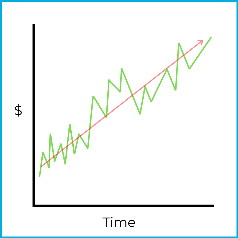
Even though this chart shows short-term ups and downs, the stock is clearly trending upward overall. If this were a one-month chart, you’d describe the market as bullish over that timeframe. Temporary declines happen in bull markets, but the higher-level view still shows a rising market.
One common way to draw a trend line is with a moving average. A moving average smooths out daily price changes by averaging prices over a set period.
For example, a 100-day moving average calculates the average price of a stock over the past 100 days. Because time keeps moving forward, the data in the average changes each day:
- Today’s closing price is added to the calculation.
- The closing price from 101 days ago drops out (it’s no longer included).
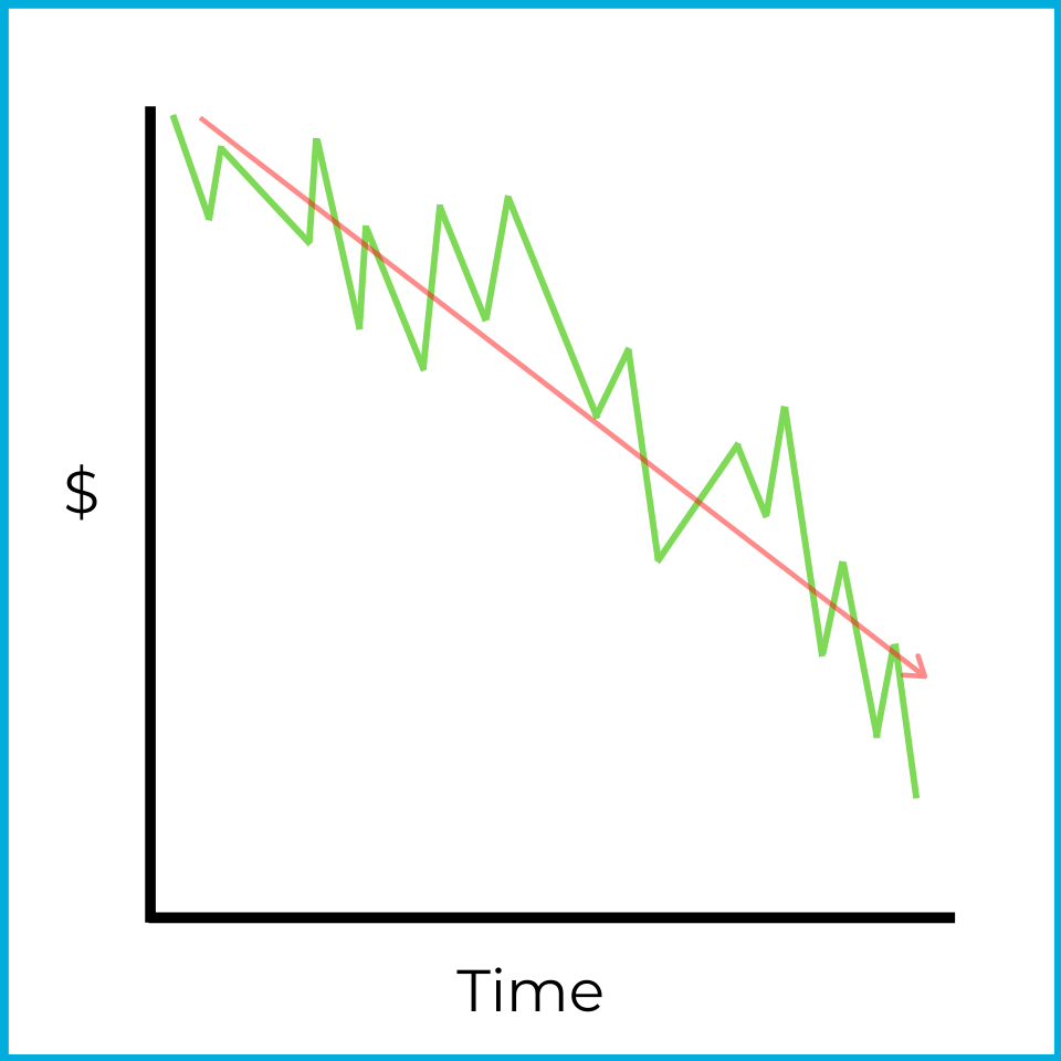
Trend lines and moving averages can also describe bearish markets. In this chart, there are several upward moves, but prices are generally falling over the period.
Trends can be identified with charts, but you can also spot them using number-based data. The S&P 500 is an index of 500 large publicly traded companies in US markets. One way to gauge the market’s overall direction is the advance/decline line, which compares how many stocks rose versus fell.
For example:
S&P 500 stocks
| Date | Price increases | Price decreases |
|---|---|---|
| Monday | 425 stocks | 75 stocks |
| Tuesday | 375 stocks | 125 stocks |
| Wednesday | 350 stocks | 150 stocks |
Over these three days, more stocks rise than fall each day, so the data suggests the market is rising. This idea is called market breadth, which refers to the overall direction of price movements across the market.
Here, breadth is bullish (increasing). At the same time, the number of declining stocks is growing each day, which suggests the market may be shifting toward bear territory. That shift is a reversal. In this context, it’s described as an overbought market.
An overbought market occurs when overall prices are rising, but the market is starting to move toward a decline. On a chart, it might look like this:
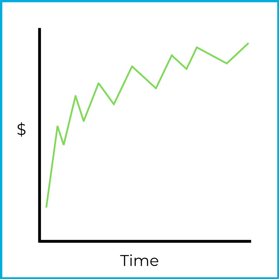
Prices are still moving up, but not as strongly as before. If that pattern continues, eventually more stocks will fall than rise, leading to an overall market decline.
Now look at the advance/decline line from the other perspective:
S&P 500 stocks
| Date | Price increases | Price decreases |
|---|---|---|
| Monday | 50 stocks | 450 stocks |
| Tuesday | 90 stocks | 410 stocks |
| Wednesday | 160 stocks | 340 stocks |
Over these three days, more stocks fall than rise each day, so the data suggests the market is falling. Again, this is market breadth.
Here, breadth is bearish (decreasing). However, the number of advancing stocks increases each day, suggesting the market may be shifting toward bull territory. This is another reversal, and it’s described as an oversold market.
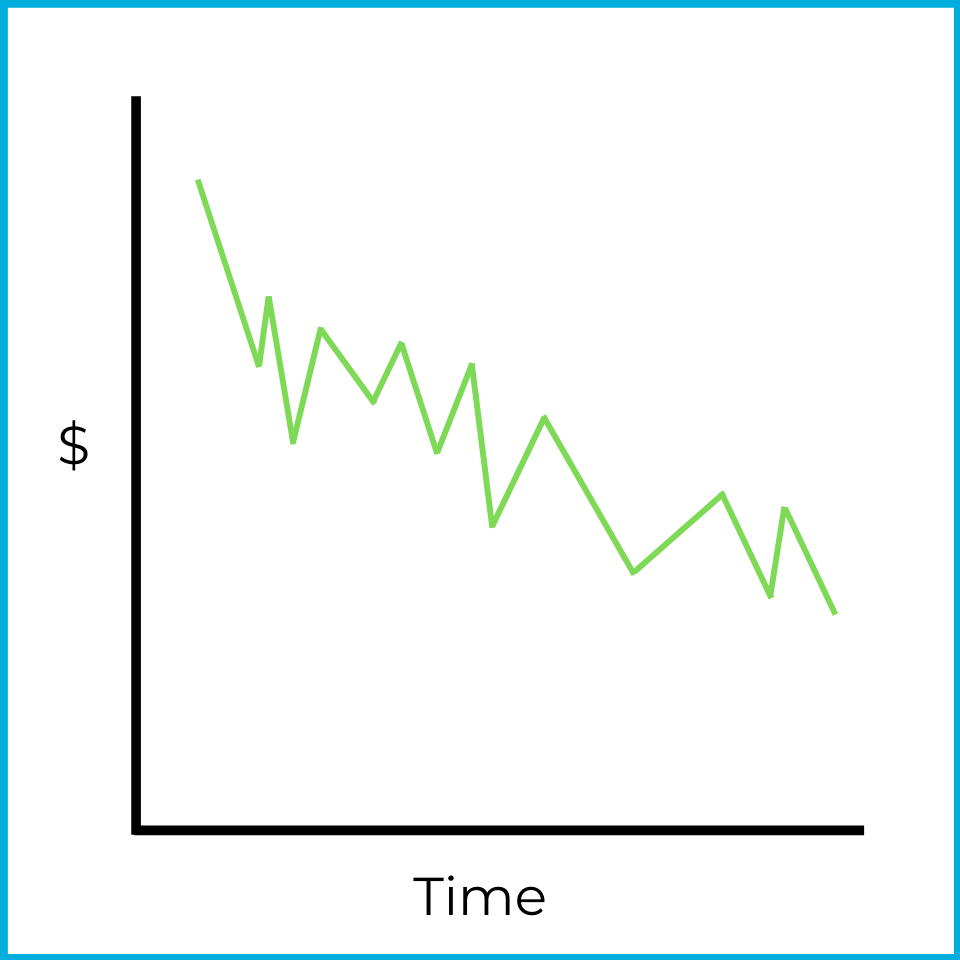
An oversold market occurs when overall prices are decreasing, but the market is starting to trend toward a rise. Prices aren’t falling as much as they were earlier. If the trend continues, eventually more stocks will increase than decrease, leading to a rising market.
When a stock price (or the overall market) shows reduced volatility, a consolidation may be occurring. If price movements look indecisive and stay within a specific range, it’s difficult to draw a clear trend. For example:
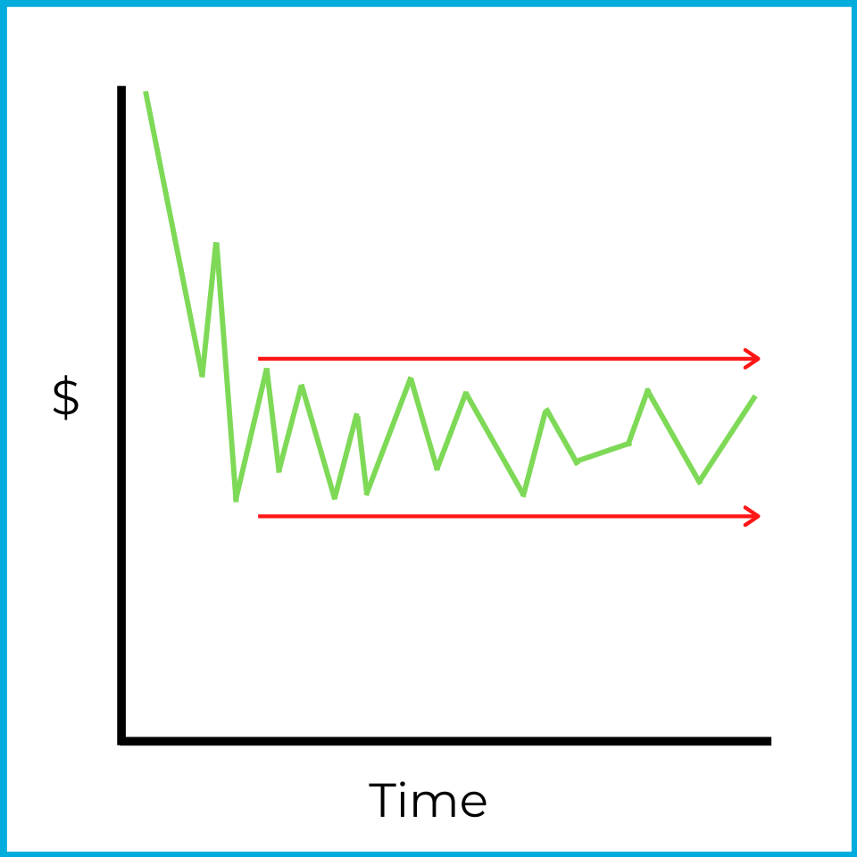
While prices were falling at first, they later stabilized and stayed within a narrow range. Traders looking for quick price movement often avoid stocks showing this behavior. However, this can be a good environment for a flat market strategy (like covered calls, which we’ll learn about later).
Market volume is another trend technical analysts watch. Volume measures how much trading occurs in a stock or in the overall market.
For example, the average daily trading volume of Snapchat stock (ticker: SNAP) is approximately 50 million shares (as of mid-2026). If the number of shares traded on a given day changes dramatically (for example, 150 million shares of SNAP trade in one day), that would stand out to a technical analyst. The meaning of a volume spike can vary, but it’s an important data point for chartists.
Resistance & support levels
If a market or stock price repeatedly fails to move above or below certain price points, you can identify resistance & support levels. For example:
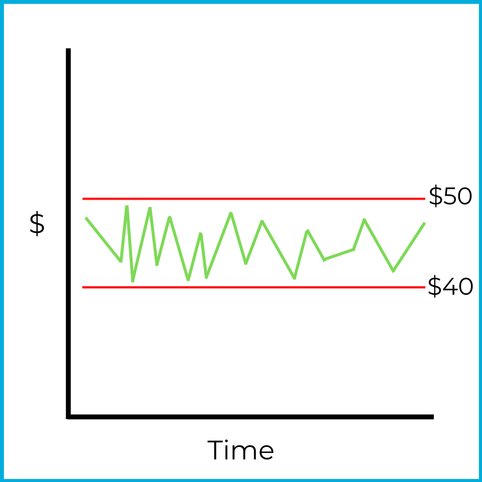
When this stock approaches $50, it reverses downward. That price is the resistance level ($50 in this example). When it approaches $40, it reverses upward. That price is the support level ($40 in this example).
This is also an example of a consolidating market, which makes it difficult to assign a clear trend. While the price stays between support and resistance, a neutral strategy (like covered calls could be profitable.
To identify a bullish or bearish trend, a breakout typically needs to occur. Here’s an example of an upside breakout:
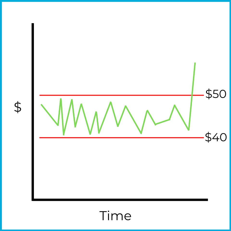
When a breakout occurs, prices often continue moving in the same direction. One explanation is that many investors watch these levels, which can create a self-fulfilling effect. When prices rise above resistance, investors may “jump on the bandwagon,” buy the stock, and push demand higher. That increased demand can drive prices up further. An upside breakout is therefore a bullish indicator.
A downside breakout is the opposite:
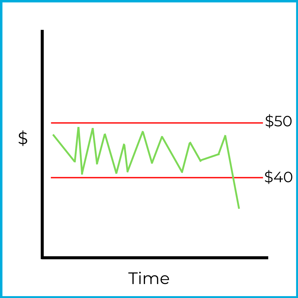
Downside breakouts also tend to continue in the same direction. When prices fall below support, investors may “jump off the bandwagon” and sell to avoid further losses. A more savvy technical analyst might sell short and profit if the market continues to fall. As investors react to the downside breakout, increased supply (sales of the security) can push the price down even further.
In the order types chapter, we’ll discuss what types of orders investors can place to benefit from an upside or downside breakout.
Theories
In general, theories about analyzing and predicting market trends fall under technical analysis. Several theories exist, but you only need to know a few for the exam.
Odd lot theory
The odd lot theory can feel a bit harsh, but it can be true at times. From your SIE studies, you may recall that a round lot is a standardized unit of trading. For stocks, a round lot is typically 100 shares. Institutions and wealthier investors often have access to more capital and more information, and they tend to trade in round lots (hundreds or thousands of shares).
An odd lot is any amount less than a round lot. If a round lot is typically 100 shares, then buying 37 shares is an odd lot.
There’s nothing inherently wrong with trading odd lots. However, the odd lot theory assumes that less skilled or less experienced investors are more likely to trade in odd lots. These investors are also more likely to buy when prices are too high and sell when prices are too low. Under this theory, if you see a clear odd-lot trading pattern, those investors are likely wrong.
A technical analyst who follows the odd lot theory watches for unusual odd-lot activity. For example, if a chartist sees a large influx of odd-lot sales in a security, they may interpret that as bullish and consider buying. Put simply, technical analysts identify odd-lot trends and do the opposite.
Short interest theory
Investors can sell short to bet against a security. Short interest measures the percentage of an issuer’s stock that has been sold short. For example, if ABC company’s short interest is 20%, then 20% of its outstanding shares have been borrowed and sold short.
A high short interest might sound bearish, but the short interest theory is counterintuitive. It says that a high level of short interest is a bullish indicator.
Here’s the reasoning. When investors sell short, they must buy the shares back later to return the borrowed shares to their financial firm. If a stock has high short interest, much of the selling pressure has already been reflected in the current price. When short sellers eventually buy to cover, that buying increases demand and can push the price upward.
Under this theory:
- The higher a stock’s short interest, the more bullish technical analysts tend to be.
- The lower a stock’s short interest, the more bearish chartists tend to be.