


Achievable logoAchievable logo
AP Statistics
Sign in
Sign up
Purchase
Textbook
Practice exams
Support
How it works
Resources
Exam catalog
Mountain with a flag at the peak
Textbook
Introduction
1. One variable data
2. Two variable data
2.1 Two categorical variables
2.2 Two quantitative variables
2.3 Least squares regression
2.4 Outliers, leverage, and influential points
3. Data collection
4. Probability and random variables
5. Sampling distributions
6. Categorical data
7. Quantitative data
8. Chi-square
9. Linear regression
Wrapping up
Achievable logoAchievable logo
2.2 Two quantitative variables
Achievable AP Statistics
2. Two variable data
Our AP Statistics course is currently in development and is a work-in-progress.

Two quantitative variables

7 min read
Font
Discuss
Share
Feedback

Variable relationships

The relationship between two quantitative variables is often shown with a scatterplot. Each point represents one observational unit:

  • The x-coordinate is the value of the explanatory variable.
  • The y-coordinate is the value of the response variable.

Two quantitative variables may or may not be related. If they are related, the association can be:

  • Strong, moderate, or weak (how tightly the points follow a pattern)
  • Positive or negative (whether the variables tend to move in the same or opposite directions)
Definitions
Strong association
A clear relationship between two variables where changes in one predict changes in the other with high accuracy. Data points stay close to the line of best fit.
Moderate association
A relationship exists between two variables, but it is not very strong. Some data points deviate from the line of best fit.
Weak association
A slight relationship between two variables that is not very reliable. Many data points deviate from the line of best fit.
No association
No relationship or correlation between the two variables. Changes in one do not predict changes in the other.
Positive association
When one variable increases, so does the other.
Negative association
When one variable increases, the other decreases.

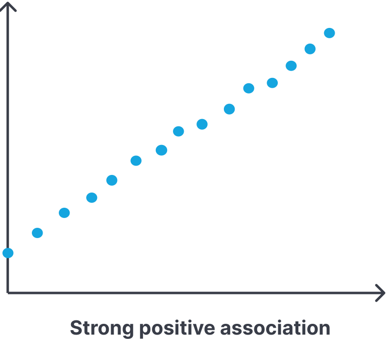
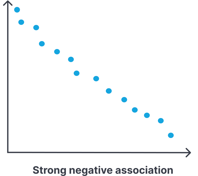
Strong association

There is a clear relationship between two variables where changes in one variable predict changes in the other with a high degree of effectiveness. The data points do not deviate much from the line of best fit.

Example:

One would likely expect the association between interest rates and bond prices to be strongly associated since one can usually predict bond prices with very good accuracy when they know the current interest rates.

Scatter plot showing a strong positive association.
Strong positive association
Scatter plot showing a strong negative association.
Strong negative association

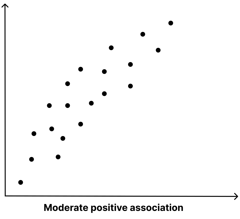
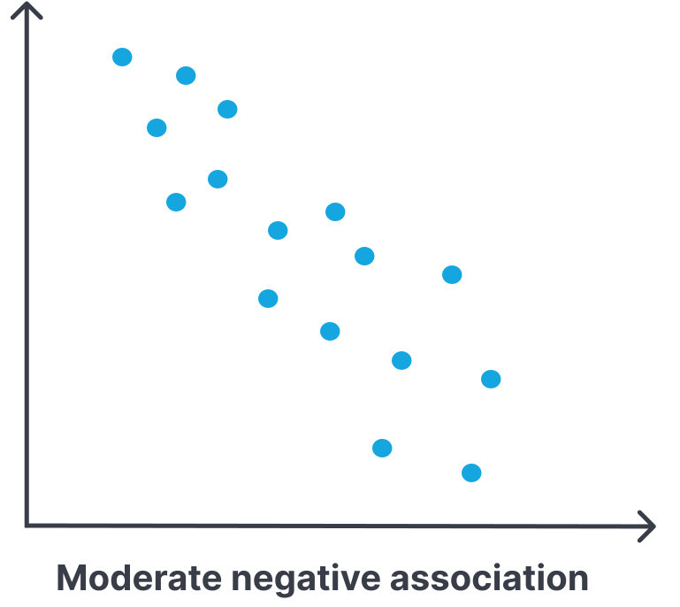
Moderate association

There is a relationship between two variables but it is not very strong. Some data points deviate somewhat from the line of best fit.

Example:

One would likely expect level of education to be moderately associated with income level. People who have a higher level of education earn more on average, but there are also a number of other factors, such as the field of work, location, sector, years of experience, etc. that also play a role on income level.

Scatter plot showing a moderate positive association.
Moderate positive association
Scatter plot showing a moderate negative association.
Moderate negative association

Weak association

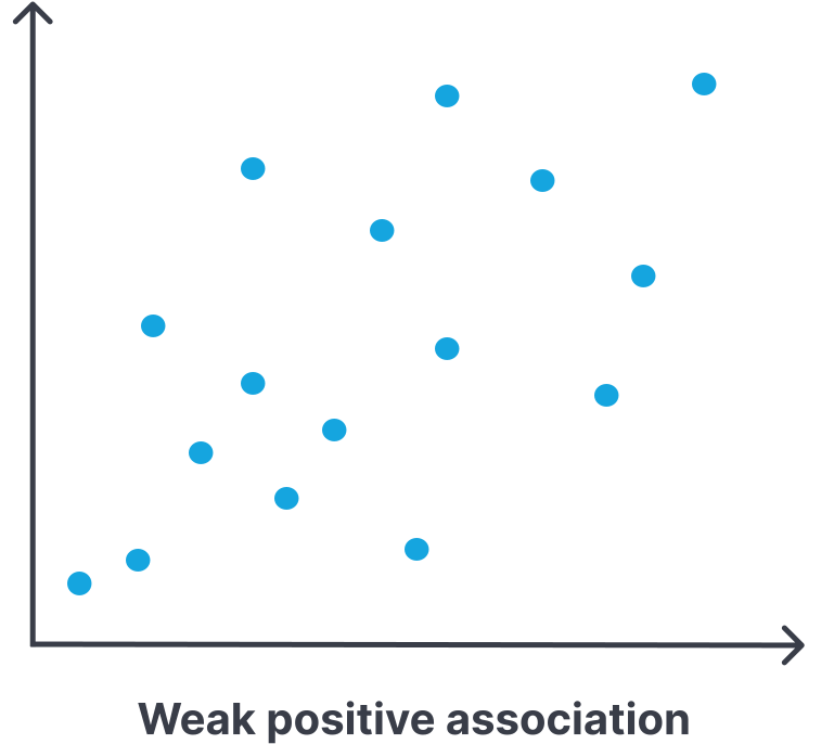
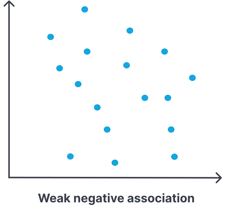
There is a slight relationship between the two variables, but it is not very reliable. Changes in one predict changes of the other with a weak degree of effectiveness. Many data points deviate from the line of best fit at various different levels.

Example:

One would likely expect that hours spent studying and scores on a math contest to be weakly associated because although studying more hours could lead to a higher score, there are other more reliable predictors such as someone’s past math contest scores, prior knowledge of the topics covered, difficulty level of the math contest (as this can vary widely from contest to contest and year to year), and the priority level or lack thereof that each student places on this math contest.

Scatter plot showing a weak positive association.
Weak positive association
Scatter plot showing a weak negative association.
Weak negative association

No association

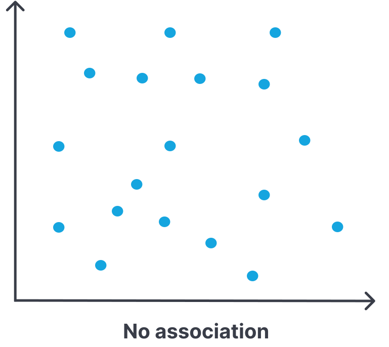
There is no relationship or correlation between the two variables. Changes in one do not predict changes in the other. The line of best fit is unreliable if there is one at all.

Example:

One would expect hair length to have no association with math mark because regardless of someone’s hair length, they could earn a higher or lower score on their math assessments, and likewise, someone earning a higher or lower math mark is not likely to change their preferences for how long or short they would prefer to have their hair.

Scatter plot showing no association.
No association

Sometimes a scatterplot makes the strength of a relationship hard to judge by eye. In that case, you can use the correlation coefficient to measure the strength and direction of a linear relationship.

r=n−11​∑(sx​xi​−xˉ​)(sy​yi​−yˉ​​)

The correlation coefficient r always falls between −1 and 1:

  • A positive value means a positive association.
  • A negative value means a negative association.
  • Values closer to −1 or 1 indicate a stronger linear relationship.
  • Values closer to 0 indicate a weaker linear relationship.

A common set of cutoffs is:

  • When ∣r∣≥0.7 there is a strong correlation.
  • When 0.4≤∣r∣<0.7 there is a moderate correlation.
  • When 0.2≤∣r∣<0.4 there is a weak correlation.
  • When ∣r∣<0.2 there is no correlation or very weak correlation.

The coefficient of determination r2 measures the percentage of variability in the y-values that can be explained by the linear regression model. There is a formula for calculating the coefficient of determination, but it is not needed for the exam. Note that the coefficient of determination falls between 0 and 1. The closer that the coefficient of determination is to 1, the closer that the data points are to falling on a straight line, and thus the more predictable data points are.

Scatterplots and association

  • Scatterplot: visualizes relationship between two quantitative variables
  • X-axis: explanatory variable; Y-axis: response variable
  • Association can be strong, moderate, weak, or none; positive or negative

Types of association

  • Strong association: points closely follow a line of best fit
  • Moderate association: points somewhat follow a line, with some deviation
  • Weak association: points loosely follow a line, with much scatter
  • No association: no discernible pattern; changes in one variable do not predict the other

Direction of association

  • Positive association: as one variable increases, the other increases
  • Negative association: as one variable increases, the other decreases

Correlation coefficient (r)

  • Measures strength and direction of linear relationship
  • Formula: r=n−11​∑(sx​xi​−xˉ​)(sy​yi​−yˉ​​)
  • Range: −1≤r≤1
    • r>0: positive association
    • r<0: negative association
    • ∣r∣ close to 1: strong linear relationship
    • ∣r∣ close to 0: weak or no linear relationship

Correlation strength cutoffs

  • Strong: ∣r∣≥0.7
  • Moderate: 0.4≤∣r∣<0.7
  • Weak: 0.2≤∣r∣<0.4
  • None/very weak: ∣r∣<0.2

Coefficient of determination (r2)

  • Measures percentage of variability in y explained by the linear model
  • Range: 0≤r2≤1
  • r2 close to 1: data points closely fit a straight line; high predictability

Sign up for free to take 7 quiz questions on this topic

Previous
Next  | 2.3 Least squares regression
All rights reserved ©2016 - 2026 Achievable, Inc.

Two quantitative variables

Variable relationships

The relationship between two quantitative variables is often shown with a scatterplot. Each point represents one observational unit:

  • The x-coordinate is the value of the explanatory variable.
  • The y-coordinate is the value of the response variable.

Two quantitative variables may or may not be related. If they are related, the association can be:

  • Strong, moderate, or weak (how tightly the points follow a pattern)
  • Positive or negative (whether the variables tend to move in the same or opposite directions)
Definitions
Strong association
A clear relationship between two variables where changes in one predict changes in the other with high accuracy. Data points stay close to the line of best fit.
Moderate association
A relationship exists between two variables, but it is not very strong. Some data points deviate from the line of best fit.
Weak association
A slight relationship between two variables that is not very reliable. Many data points deviate from the line of best fit.
No association
No relationship or correlation between the two variables. Changes in one do not predict changes in the other.
Positive association
When one variable increases, so does the other.
Negative association
When one variable increases, the other decreases.

Strong association

There is a clear relationship between two variables where changes in one variable predict changes in the other with a high degree of effectiveness. The data points do not deviate much from the line of best fit.

Example:

One would likely expect the association between interest rates and bond prices to be strongly associated since one can usually predict bond prices with very good accuracy when they know the current interest rates.

Moderate association

There is a relationship between two variables but it is not very strong. Some data points deviate somewhat from the line of best fit.

Example:

One would likely expect level of education to be moderately associated with income level. People who have a higher level of education earn more on average, but there are also a number of other factors, such as the field of work, location, sector, years of experience, etc. that also play a role on income level.

Weak association

There is a slight relationship between the two variables, but it is not very reliable. Changes in one predict changes of the other with a weak degree of effectiveness. Many data points deviate from the line of best fit at various different levels.

Example:

One would likely expect that hours spent studying and scores on a math contest to be weakly associated because although studying more hours could lead to a higher score, there are other more reliable predictors such as someone’s past math contest scores, prior knowledge of the topics covered, difficulty level of the math contest (as this can vary widely from contest to contest and year to year), and the priority level or lack thereof that each student places on this math contest.

No association

There is no relationship or correlation between the two variables. Changes in one do not predict changes in the other. The line of best fit is unreliable if there is one at all.

Example:

One would expect hair length to have no association with math mark because regardless of someone’s hair length, they could earn a higher or lower score on their math assessments, and likewise, someone earning a higher or lower math mark is not likely to change their preferences for how long or short they would prefer to have their hair.

Sometimes a scatterplot makes the strength of a relationship hard to judge by eye. In that case, you can use the correlation coefficient to measure the strength and direction of a linear relationship.

r=n−11​∑(sx​xi​−xˉ​)(sy​yi​−yˉ​​)

The correlation coefficient r always falls between −1 and 1:

  • A positive value means a positive association.
  • A negative value means a negative association.
  • Values closer to −1 or 1 indicate a stronger linear relationship.
  • Values closer to 0 indicate a weaker linear relationship.

A common set of cutoffs is:

  • When ∣r∣≥0.7 there is a strong correlation.
  • When 0.4≤∣r∣<0.7 there is a moderate correlation.
  • When 0.2≤∣r∣<0.4 there is a weak correlation.
  • When ∣r∣<0.2 there is no correlation or very weak correlation.

The coefficient of determination r2 measures the percentage of variability in the y-values that can be explained by the linear regression model. There is a formula for calculating the coefficient of determination, but it is not needed for the exam. Note that the coefficient of determination falls between 0 and 1. The closer that the coefficient of determination is to 1, the closer that the data points are to falling on a straight line, and thus the more predictable data points are.

Key points

Scatterplots and association

  • Scatterplot: visualizes relationship between two quantitative variables
  • X-axis: explanatory variable; Y-axis: response variable
  • Association can be strong, moderate, weak, or none; positive or negative

Types of association

  • Strong association: points closely follow a line of best fit
  • Moderate association: points somewhat follow a line, with some deviation
  • Weak association: points loosely follow a line, with much scatter
  • No association: no discernible pattern; changes in one variable do not predict the other

Direction of association

  • Positive association: as one variable increases, the other increases
  • Negative association: as one variable increases, the other decreases

Correlation coefficient (r)

  • Measures strength and direction of linear relationship
  • Formula: r=n−11​∑(sx​xi​−xˉ​)(sy​yi​−yˉ​​)
  • Range: −1≤r≤1
    • r>0: positive association
    • r<0: negative association
    • ∣r∣ close to 1: strong linear relationship
    • ∣r∣ close to 0: weak or no linear relationship

Correlation strength cutoffs

  • Strong: ∣r∣≥0.7
  • Moderate: 0.4≤∣r∣<0.7
  • Weak: 0.2≤∣r∣<0.4
  • None/very weak: ∣r∣<0.2

Coefficient of determination (r2)

  • Measures percentage of variability in y explained by the linear model
  • Range: 0≤r2≤1
  • r2 close to 1: data points closely fit a straight line; high predictability

More from Two variable data

  • Two categorical variables
  • Least squares regression
  • Outliers, leverage, and influential points