Trend questions
A trend is a pattern in a graph or table of data. On the ACT, trends are often used to relate two different variables. Trend questions are very common in the Science section, so you should be comfortable spotting and describing them.
Identifying trends
First, you’ll learn how to recognize trends in tables and graphs. Then you’ll see how to use a trend to make a prediction.
Trends in tables
When you look for trends in tables, you usually compare two columns. Even if a table has many columns, the question will typically ask you to relate just two of them. Here’s a simple example using columns and :
| 1 | 5 |
| 2 | 10 |
| 3 | 15 |
| 4 | 20 |
| 5 | 25 |
As the values increase, the values also increase. That’s the trend in this table.
If that feels straightforward, try describing the trend in the next example.
| Temperature (º) | Density (m3/kg) | Viscosity (mm2/s) | Vapor pressure (kPa) |
|---|---|---|---|
| 15 | 1.004 | 1.3 | 1.74 |
| 20 | 1.000 | 1.1 | 2.35 |
| 25 | 0.998 | 1.0 | 3.16 |
| 30 | 0.994 | 0.8 | 4.19 |
| 35 | 0.990 | 0.5 | 5.52 |
As temperature increases, what happens to the viscosity of the chemicals?
Give it a try, then check the explanation.
As temperature increases (from to ), viscosity decreases (from to ).
Even though the table has several columns, you only need the two mentioned in the question: temperature and viscosity. To spot the trend, move down the table and watch how one column changes as the other increases.
Trends in graphs
To find a trend in a graph, look at the line (or the pattern of points) and describe how it moves as you go from left to right.
- As the -axis values increase, does the line go up or down?
- In other words, do the values increase or decrease?
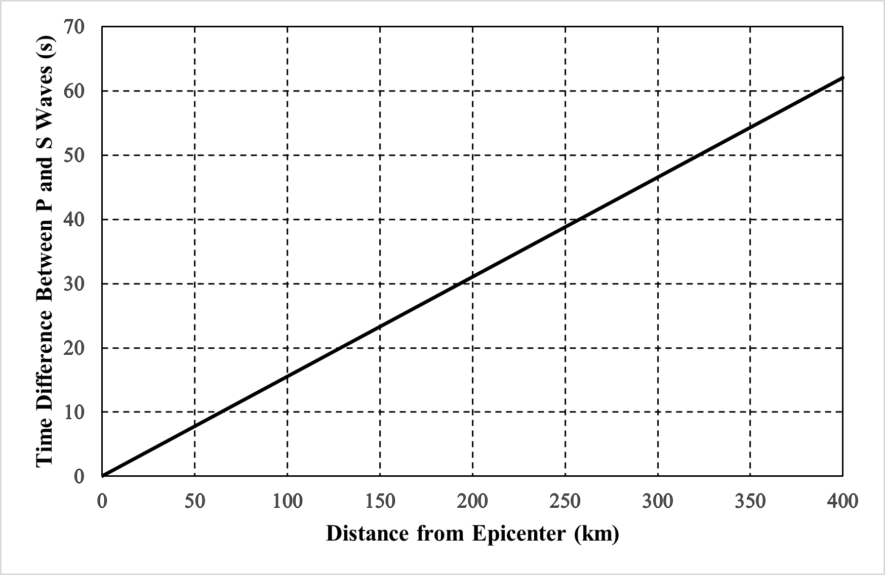
In this graph, the line rises as you move to the right. That means as increases, increases. In context, you could say: “As the distance from the epicenter increases, the time difference between P and S waves also increases.”
If a graph has multiple lines, they may not follow the same trend. One line might increase while another decreases. Make sure you’re describing the trend for the specific line the question asks about.
Using trends as prediction
Some questions ask you to estimate a value that isn’t shown directly, based on the trend. For example, the graph above ends at km. A question might ask you to predict the time difference between P and S waves at km. There are a few ways to do this.
First, you can use a quick (but not perfectly precise) method: extend the line visually. In other words, sketch how the line would continue past where it stops, following the same general direction and steepness. Second, you can estimate using the most recent change in the graph. Here, you want the value km after the graph ends, so look at how much the line changes over the last km shown (from to ). Here’s the graph again:
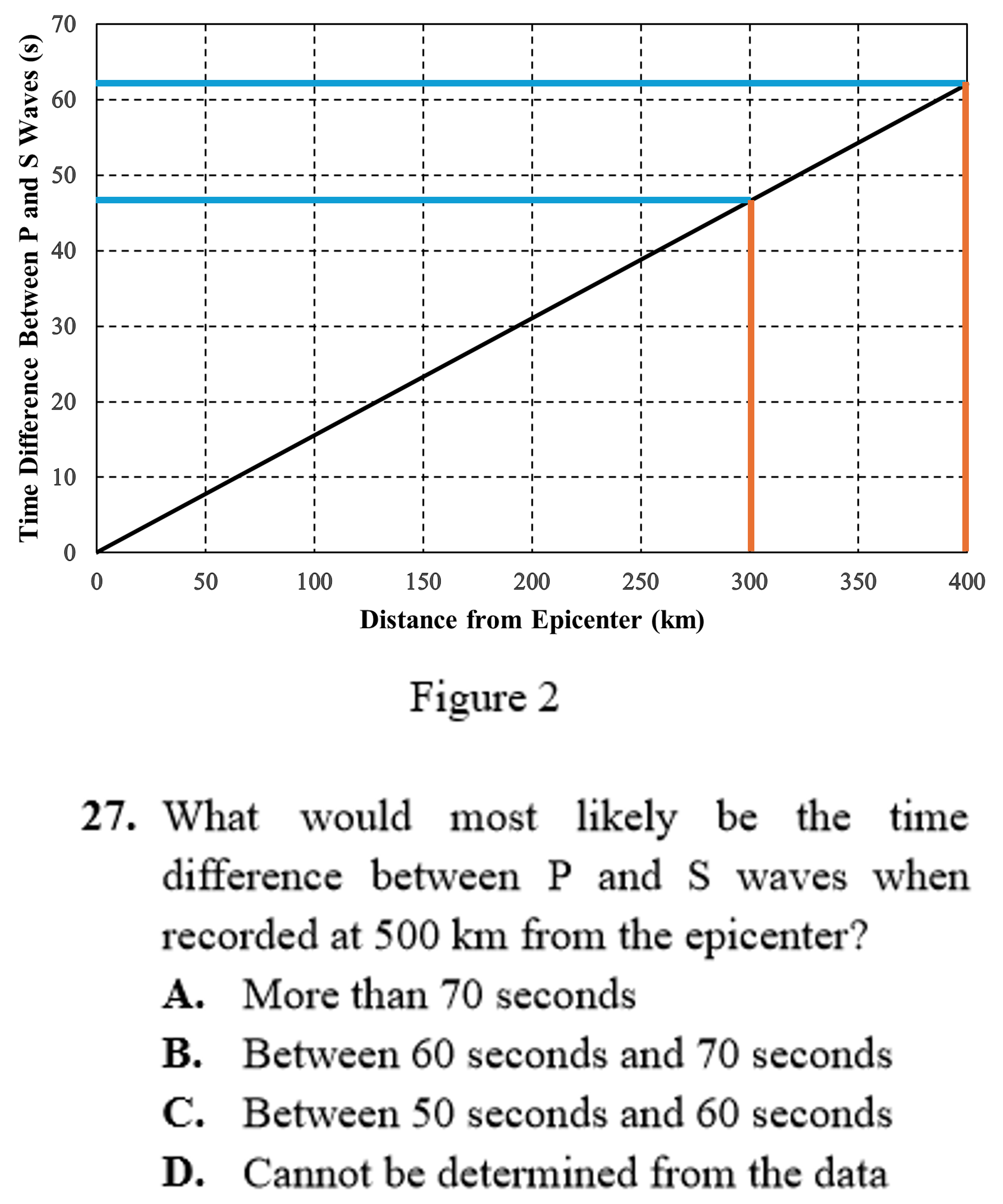
From to (a change of km), the line increases by about seconds on the -axis, from to (shown by the blue lines). Use that same increase to estimate the value at km:
- Start from the last known point:
- Add the estimated increase over the next km:
No matter which method you use, the goal is the same: extend the trend to the value mentioned in the question and estimate the corresponding value.