

Tabulating data and charts
A common way to present data is with tables. For exam purposes, it’s also useful to know tallying, which is another way to tabulate data.
With tallying, you:
- choose categories (often called classes or groups)
- count how many observations fall into each category
We’ll use the example below to show how it works.
Example 1
KTA is a company that specializes in online lecturing, and it charges its customers per hour. Although the classes are timed on an hourly basis, some classes take longer or less than an hour and the managing board of KTA are trying to find ways to improve the timeliness of the classes. Below are the number of minutes each class took last month.
| 50 | 55 | 54 | 53 | 55 | 57 | 65 | 69 |
|---|---|---|---|---|---|---|---|
| 67 | 67 | 59 | 60 | 60 | 60 | 60 | 65 |
| 67 | 68 | 65 | 55 | 53 | 69 | 58 | 58 |
Let’s use grouping format
In a grouped frequency table, each row covers a time interval, and you record:
- the tally (a quick counting mark)
- the frequency (the final count)
| Time | tally | Freq |
|---|---|---|
| 50 to below 55 | 4 | 4 |
| 55 to below 60 | 7 | 11 |
| 60 to below 65 | 4 | 15 |
| 65 to below 70 | 9 | 24 |
Grouping is recommended when dealing with continuous variables (values that can take decimals, or values that are unlikely to repeat exactly). Grouping is also helpful when you have many data points and want a clearer summary.
Discrete variables, in simple terms, are whole-number counts (no decimals). They can repeat often. In the table above, several values repeat, which is typical of discrete-style data (for example, multiple observations fall between 65 and 70).
The use of charts and curves to display data or processed data(information)
Pie charts
Pie charts are a common presentation format because they show how a total is split into parts.
A pie chart is a circle with 360 degrees. Each category gets a “slice” based on its share of the total.
Let’s look at the example below.
Example 2
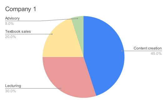
KTA offers four different services which are lecturing, selling study content, writing content for other providers and advisory for students. Below are the revenue shares for all 4 services.
| Sales | % share |
|---|---|
| Content creation | 100000 |
| Lecturing | 60000 |
| Textbook sales | 40000 |
| Advisory | 15000 |
| Total | 215000 |
To get the angle for a slice in the pie chart, multiply the percentage share by 360 degrees.
For example, 7% of 360 degrees is 25.2 degrees, and the pie chart represents that slice size.
Bar graphs
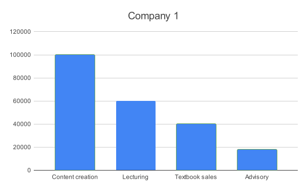
If an organization wants a clear comparison between categories, it can use a bar graph. You read a bar graph by comparing the heights of the bars.
Keep in mind:
- A pie chart emphasizes proportional sizes (shares of the whole).
- A bar graph can show the actual figures (for example, sales in $ or units) on each bar.
Let’s use the data from the previous illustration and present the information on a bar graph.
Multiple bar charts
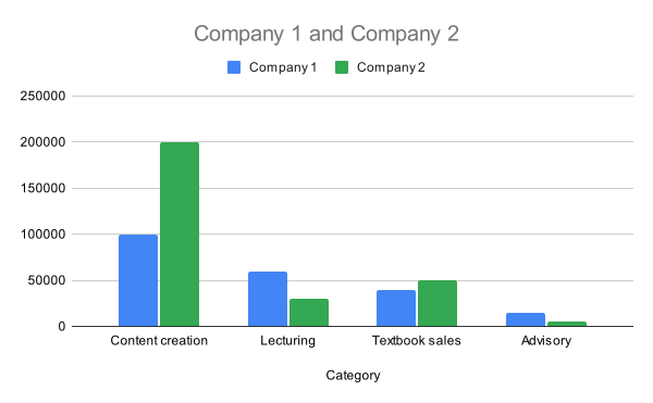
Multiple bar charts are useful when you want to compare the same categories across different groups (for example, one college’s results versus another).
| Service | KTA | SDA |
|---|---|---|
| Content creation | 100000 | 200000,0 |
| Lecturing | 60000 | 30000,00 |
| Textbook sales | 40000 | 50000,00 |
| Advisory | 15000 | 5000,00 |
As you can see, comparisons can be made across the companies’ services, which gives a clear picture for management and investors.
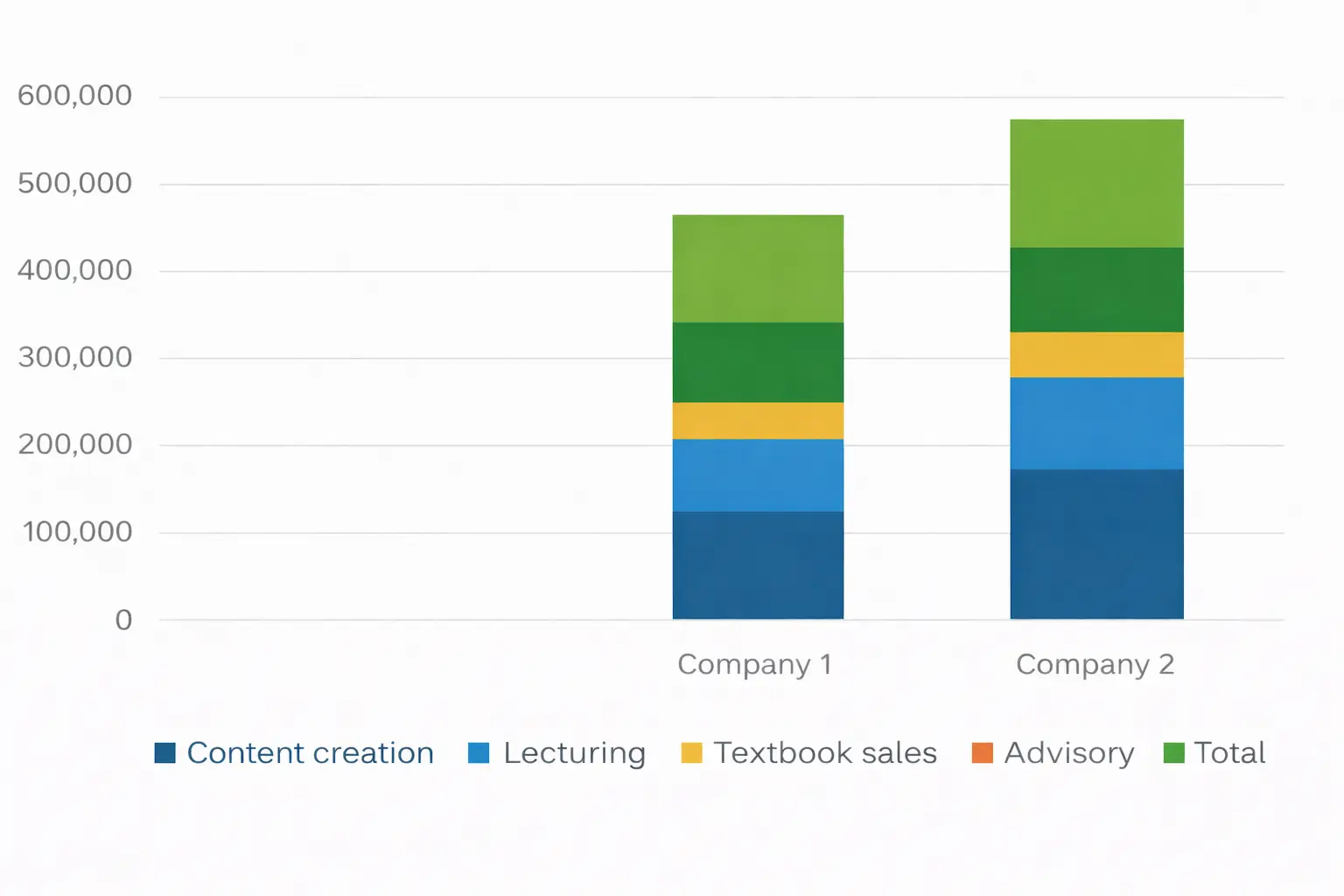
Compound Bar Graph
Sometimes management is interested in the grand totals across companies, not just category-by-category comparisons. A compound bar graph helps show those totals.
Let’s use the previous example to demonstrate this.
As you can see, if investors choose between the two companies based on overall performance, they will pick company 2.
Histograms
So far, the bar graphs we’ve looked at are read using the height of each bar. A histogram is different: it is read using the area of each bar. This makes histograms especially useful when class widths are unequal.
Suppose you are a parent, and you sit an exam with your 10-year-old daughter. You score 60% and your daughter scores 55%. It’s easy to say you scored higher, but that comparison ignores an important context difference (age and experience). In data presentation, a similar kind of unfair comparison can happen when groups are different sizes. Histograms help address that issue by focusing on comparable areas.
Example 3
KTA has the following students at each level of CIMA, and they have been grouped based on the revenue they generate in total.
| Students | Sales |
|---|---|
| Certificate Level | 100 |
| Operational Level | 100 |
| Management Level | 200 |
| Strategic level | 50 |
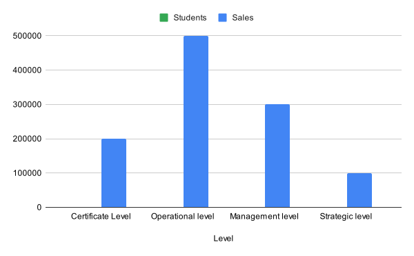
If we use a simple bar graph the results will look like the following:
As you can see, the bar graph fails to consider the class sizes, which affects the revenues.
Now, let’s present it under a histogram.
To do that, make the normal class size 100 students. This means:
- the class with 50 students will have its revenue multiplied by 2 to match the normal class size
- any class above 100 students will have its revenue divided by the required proportion
For example, the class with 200 students will have its revenue divided by 2:
| Students | Sales |
|---|---|
| 100 | 200000 |
| 100 | 500000 |
| 200 | 150000 |
| 50 | 200000 |
This adjustment removes the unfairness caused by different class sizes. The first two classes are left unadjusted because 100 students is the chosen baseline.
Ogive
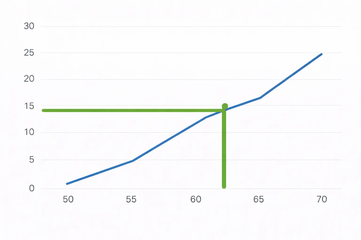
An ogive is a curve that shows the cumulative distribution of data. We’ll use the data from Example 1 so you can see what an ogive is used for.
| Time | Frequency |
|---|---|
| 50 | 0 |
| 55 | 4 |
| 60 | 11 |
| 65 | 15 |
| 70 | 24 |
A question may come in the exam as follows:
The management is worried that the lecturers are spending more time in classes than necessary, and it wants to understand currently the percentage of time under 60 mins as per tutoring requirements.
To read this from the ogive:
- Start at 60 mins on the horizontal axis.
- Draw a vertical line up until it meets the curve.
- From that point, draw a horizontal line left to the Y axis.
From the curve shown, it appears that 11 out of 24 classes meet the 60-minute target (60 mins or below), which is approximately 46%.
This suggests the college is not meeting its timeliness target. If duration were kept under 60 mins more often, more classes could potentially be allocated due to time saved.