Update it, or open this page in a current version of Chrome, Safari, Firefox or Edge. On an iPhone or iPad, update iOS: every browser there runs on the version of Safari that comes with it.
1.1 Categorical and quantitative variables
Achievable AP Statistics
1. One variable data
Our AP Statistics course is currently in development and is a work-in-progress.
You can display categorical data with a bar chart, a pie chart, or a dot plot.
Practice problem
It’s possible to create a bar chart, a pie chart, and a dot plot to represent this data.
Bar chart
In a bar chart:
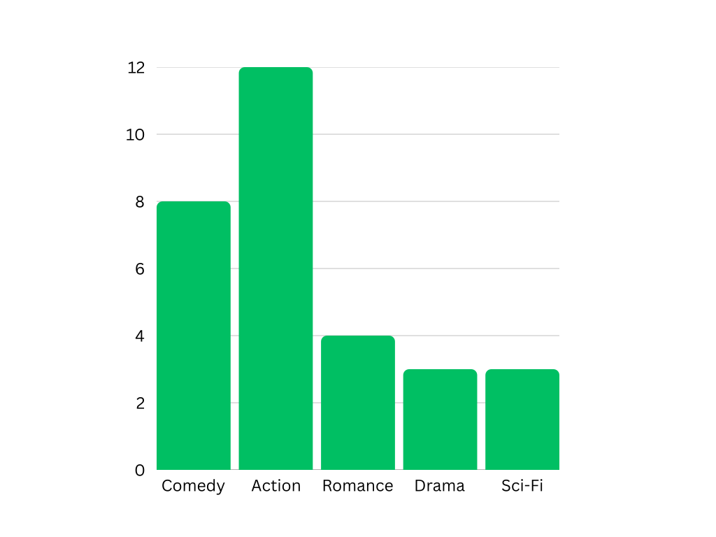
The x-axis lists the categories (here, the movie genres).
The y-axis shows frequency (how many students chose each genre).
Each category gets a bar whose height equals its frequency.
Here is the bar graph that represents this data:
Bar graph example
Achievable
Pie chart
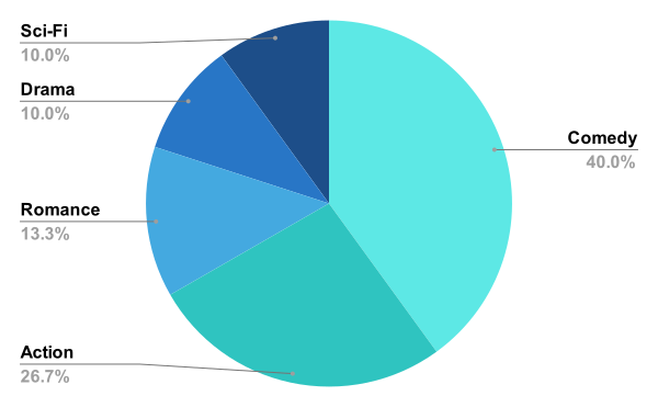
To create a pie chart, first convert each category’s count into a percentage of the total (30 students).
Category
Students
Fraction
Percent
Comedy
8
308
≈27%
Action
12
3012
=40%
Romance
4
304
≈13%
Drama
3
303
=10%
Sci-fi
3
303
=10%
In the pie chart, the size of each slice matches the percentage for that genre.
Pie chart example
Achievable
Quantitative variables
Quantitative data can be represented by dot plots, histograms, stemplots, cumulative relative frequency plots, or boxplots.
To describe the distribution of quantitative data, it’s important to consider:
Shape
Center
Spread
Outliers
Clusters
Gaps
Shape
Many different shapes are possible, but here are some common patterns:
Center
The center is a “typical” value for the distribution. You’ll usually describe center using either the mean or the median.
Spread
Spread describes how far apart the values are.
In future chapters, there will be examples and further details regarding variance, standard deviation, and the usefulness of both of them.
Outliers, clusters, and gaps
Outliers are values that fall far outside the expected range. For example, a person who has an IQ of 145 is an outlier because about 95% of people have an IQ from 70–130. An American who earned 5 million dollars last year is an outlier, because less than
Categorical variables
Values are category names or group labels
Two types:
Nominal: labels have no natural order (e.g., color, food)
Ordinal: labels have a logical ranking (e.g., education level, frequency)
Displaying categorical data
Use bar charts or pie charts
Bar chart: x-axis = categories, y-axis = frequency
Pie chart: convert counts to percentages; slice size = percentage
Quantitative variables
Take on numerical values representing amounts or measurements
Two types:
Discrete: countable, finite values (e.g., number of students)
Continuous: measurable values that can take on any value within an interval (e.g., height, weight, time)
Describing quantitative distributions
Key features to describe: shape, center, spread, outliers, clusters, gaps
Displayed using dot plots, histograms, stemplots, cumulative relative frequency plots, or boxplots
Shape
Symmetric: vertical line of symmetry near the mean
Skewed right: tail extends to the right; mean pulled up by high outliers
Skewed left: tail extends to the left; mean pulled down by low outliers
Bell-shaped: mound at center with two tails (e.g., IQ scores)
Uniform: all values appear with equal frequency
Center
Mean: sum of all values ÷ number of values
Median: middle value when data is ordered; splits data exactly in half
Spread
Range: maximum − minimum
Interquartile range (IQR): upper quartile − lower quartile
Variance: average of squared deviations from the mean
Standard deviation: positive square root of variance
Outliers, clusters, and gaps
Outliers: values falling far outside the expected range
Sign up for free to take 13 quiz questions on this topic
You can display categorical data with a bar chart, a pie chart, or a dot plot.
Practice problem
It’s possible to create a bar chart, a pie chart, and a dot plot to represent this data.
Bar chart
In a bar chart:
The x-axis lists the categories (here, the movie genres).
The y-axis shows frequency (how many students chose each genre).
Each category gets a bar whose height equals its frequency.
Here is the bar graph that represents this data:
Pie chart
To create a pie chart, first convert each category’s count into a percentage of the total (30 students).
Category
Students
Fraction
Percent
Comedy
8
308
≈27%
Action
12
3012
=40%
Romance
4
304
≈13%
Drama
3
303
=10%
Sci-fi
3
303
=10%
In the pie chart, the size of each slice matches the percentage for that genre.
Quantitative variables
Quantitative data can be represented by dot plots, histograms, stemplots, cumulative relative frequency plots, or boxplots.
To describe the distribution of quantitative data, it’s important to consider:
Shape
Center
Spread
Outliers
Clusters
Gaps
Shape
Many different shapes are possible, but here are some common patterns:
Center
The center is a “typical” value for the distribution. You’ll usually describe center using either the mean or the median.
Spread
Spread describes how far apart the values are.
In future chapters, there will be examples and further details regarding variance, standard deviation, and the usefulness of both of them.
Outliers, clusters, and gaps
Outliers are values that fall far outside the expected range. For example, a person who has an IQ of 145 is an outlier because about 95% of people have an IQ from 70–130. An American who earned 5 million dollars last year is an outlier, because less than