Technical analysis
In the previous chapter, you learned about fundamental analysis, which involves evaluating a company’s financial condition. Now we’re shifting to a different approach.
Technical analysis focuses on identifying and forecasting trends in the stock market. Technical analysts typically pay little to no attention to a company’s fundamentals (for example, expenses, revenue, or earnings). Instead, they look for repeating price patterns and try to profit if those patterns appear again.
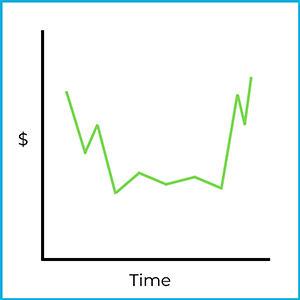
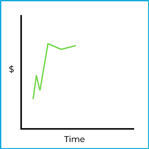
A core idea in technical analysis is that market behavior tends to repeat over time. To see what that means, look at this stock chart:
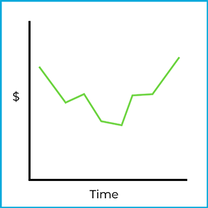
This may look like a basic price chart, but a technical analyst would recognize a specific pattern. In this case, it’s a head and shoulders bottom formation. Even though the price movement in the chart has already happened, the pattern can be used as a clue about what might happen next.
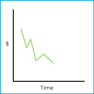
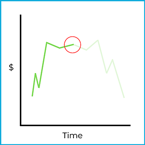
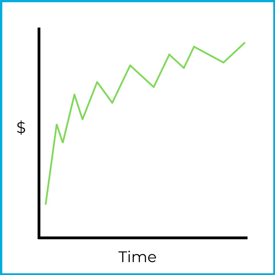
For example, suppose that a few days later the same stock starts fluctuating like this:
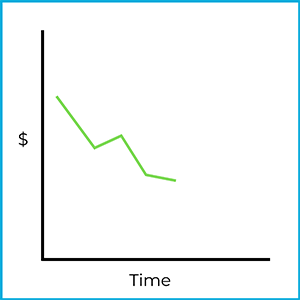
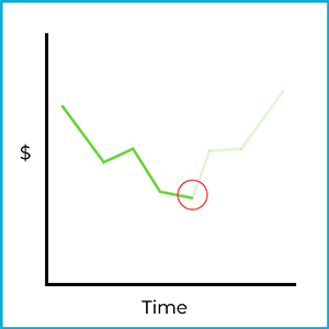
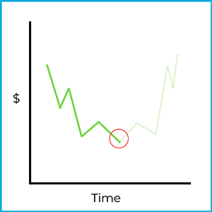
There’s no guarantee the price will move the same way again, but real markets do sometimes show repeating trends. If this stock follows the same trajectory as before, buying at this point could be profitable:
The key limitation is that the market is unpredictable. Technical analysis is a tool for making informed predictions, but not all predictions come true. Because this approach relies heavily on reading charts, technical analysts are often called “chartists” (chart artists).
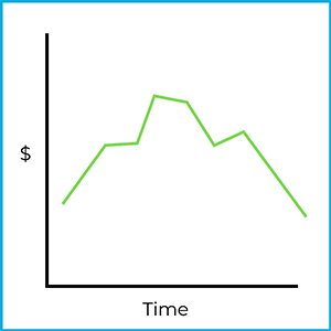
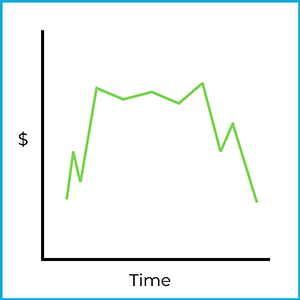
A head and shoulders top formation is the opposite of the bottom formation. It resembles the outline of a person: the price rises, levels off, rises to a higher peak (the “head”), levels off again, and then begins to fall. This suggests an upward trend has peaked and may reverse downward:
Saucers
Saucer formations are market trends that include a reversal. There are two types of saucer formations: saucer bottom formations and saucer top formations.
A saucer bottom formation looks something like this:
It resembles a saucer (or bowl). Technical analysts look for patterns like this because they can suggest a change in direction. Here, the price declines, bottoms out, and then begins moving upward again. That change is a reverse downward trend: the stock was trending down, then reversed upward.
Chartists try to spot the early stage of a saucer bottom formation. For example:
If a chartist identified this as the beginning stage of a saucer bottom formation, they could try to profit by going long (buying) the stock at this point:
Of course, the market could move in a different direction. A technical analyst who trades on this pattern is taking a risk, even if the pattern has appeared before.
If you flip the previous charts upside down, you get a saucer top formation:
This looks like an upside-down saucer (bowl). The market trends upward, flattens out, and then reverses downward. That change is a reverse upward trend: the stock was trending up, then reversed downward. Chartists watch for the early stage of a saucer top formation as well.
If this is correctly identified as the beginning of a saucer top formation, an investor could try to profit by going short (short selling) the stock at this point:
Again, the market could move in a different direction. Selling short also involves unlimited risk, so a trader relying on this pattern is taking on significant risk. If the trend continues downward beyond this chart, the short seller profits.
Market trends
A market trend describes the market’s general direction over time. On any given trading day, prices move up and down. A trend line helps you see the “big picture” direction.
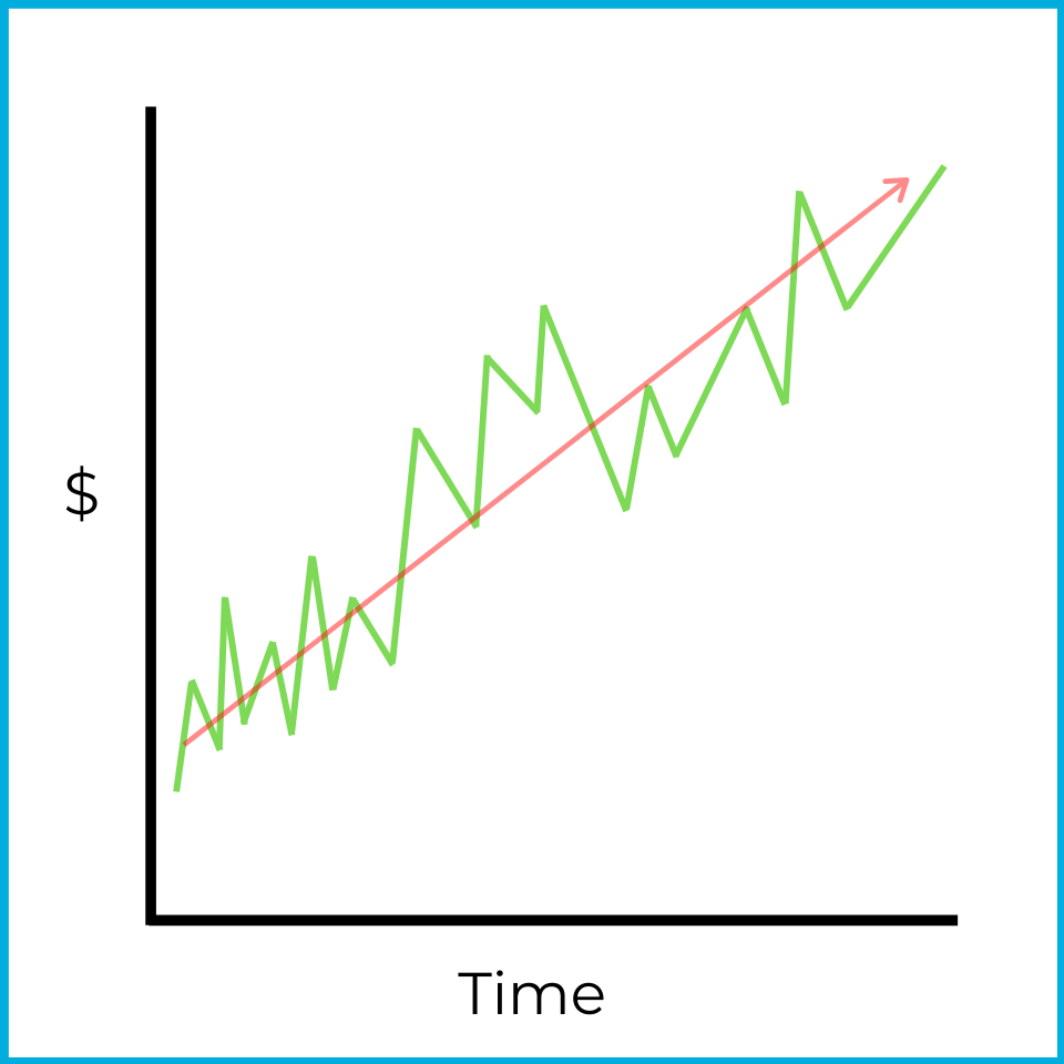
Even though this chart includes declines, the overall direction is upward. Over a longer period (for example, a month), this would be described as bullish. Bull markets still include temporary pullbacks, but the overall direction is rising.
One common way to draw a trend line is with a moving average. A 100-day moving average is the average price of a stock over the last 100 days. Because the window “moves” forward each day:
- Today’s closing price is added to the calculation.
- The closing price from 101 days ago drops out.
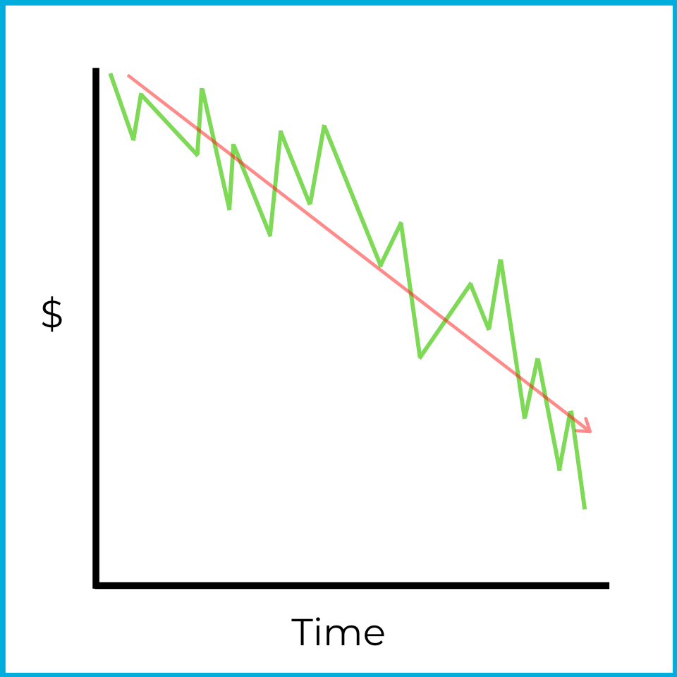
Trend lines and moving averages can also show bearish markets. This chart has several upward moves, but the overall direction is downward.
Trends can be identified with charts and with numerical market data. The S&P 500 is an index of 500 large publicly traded companies in US markets. One way to gauge the market’s direction is the advance/decline line, which compares how many stocks rose versus fell.
S&P 500 stocks
| Date | Price increases | Price decreases |
|---|---|---|
| Monday | 425 stocks | 75 stocks |
| Tuesday | 375 stocks | 125 stocks |
| Wednesday | 350 stocks | 150 stocks |
Over these three days, more stocks rise than fall each day, so the market breadth is bullish overall. At the same time, the number of declining stocks increases each day, which suggests the market may be weakening and could be approaching a reversal. This situation is described as an overbought market.
An overbought market occurs when overall prices are rising, but the market is starting to shift toward a decline. In chart form, it might look like this:
Prices are still rising, but the upward movement is losing strength. If that continues, declines may eventually outnumber advances, leading to an overall market drop.
Now look at the advance/decline line from the opposite perspective:
S&P 500 stocks
| Date | Price increases | Price decreases |
|---|---|---|
| Monday | 50 stocks | 450 stocks |
| Tuesday | 90 stocks | 410 stocks |
| Wednesday | 160 stocks | 340 stocks |
Here, more stocks fall than rise each day, so market breadth is bearish overall. However, the number of advancing stocks increases each day, suggesting the market may be approaching another reversal. This is described as an oversold market.
An oversold market occurs when overall prices are falling, but the market is starting to shift toward a rise. Prices are still declining, but the downward movement is losing strength. If that continues, advances may eventually outnumber declines, leading to an overall market increase.
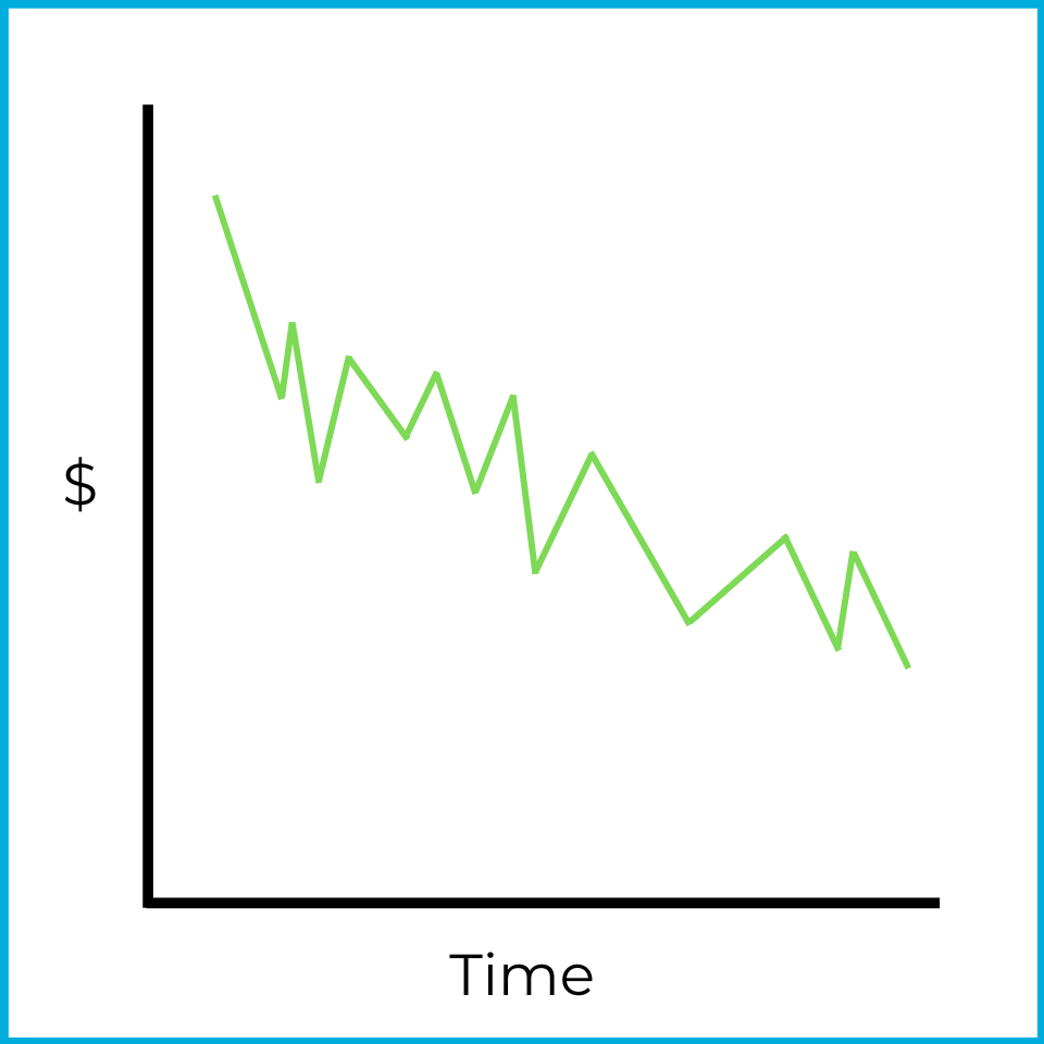
When a stock or the overall market shows reduced volatility, a consolidation may be occurring. In a consolidation, price movements are indecisive and stay within a relatively narrow range, which makes it difficult to identify a clear trend. For example:
Prices fall at first, then stabilize and trade within a tight range. Traders looking for quick directional moves often avoid stocks behaving this way. However, this can be a good environment for a flat-market strategy (like covered calls, which we’ll cover later).
Market volume is another trend technical analysts watch. Volume measures how much trading occurs in a stock or in the overall market. For example, the average daily trading volume of Snapchat stock (ticker: SNAP) is approximately 50 million shares (3-month average, as of mid-2026). If the number of shares traded changes dramatically on a given day (for example, 150 million shares of SNAP trading in one day), that often signals something meaningful to a chartist. The reason for the volume change can vary, but volume is an important data point in technical analysis.
Resistance & support levels
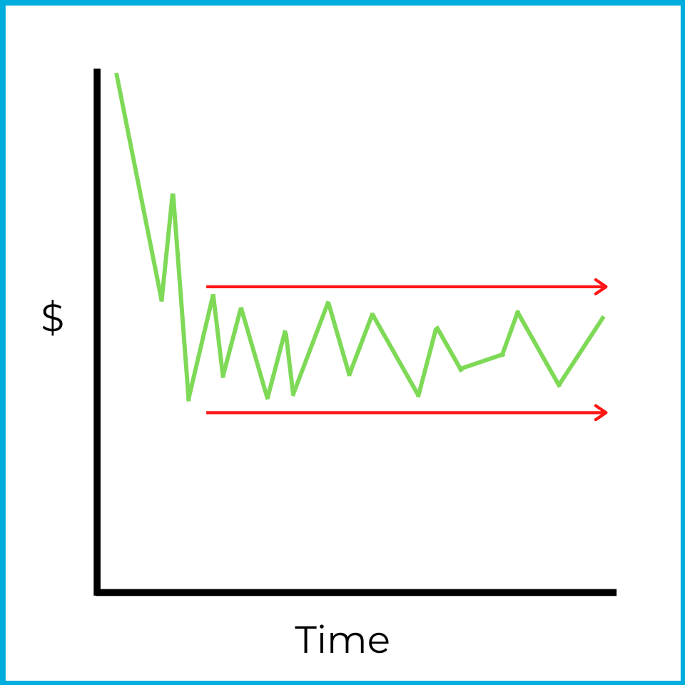
If a stock price repeatedly struggles to move above or below certain levels, you can identify resistance & support levels. For example:
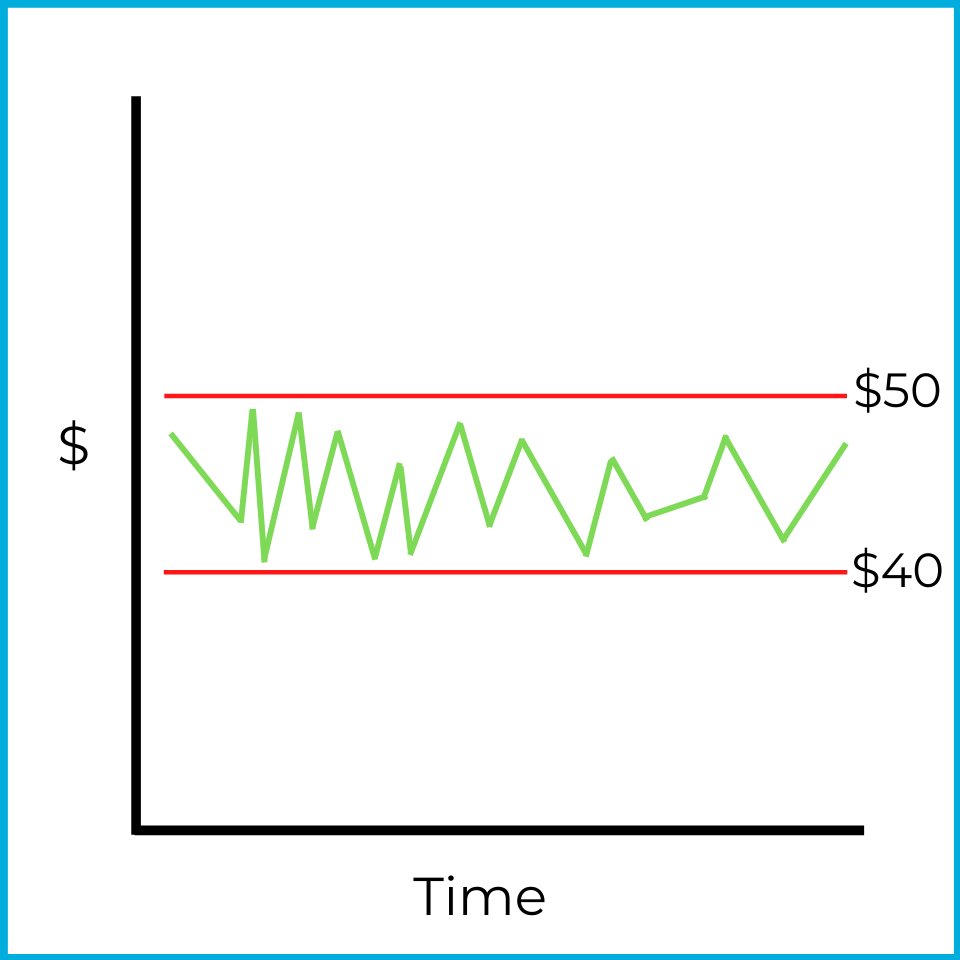
When this stock approaches $50, it tends to reverse downward. That price level is the resistance level ($50 here). When it approaches $40, it tends to reverse upward. That price level is the support level ($40 here).
This is also an example of a consolidating market, which makes it difficult to assign a clear bullish or bearish trend. While the price stays between support and resistance, a neutral strategy (like covered calls could be profitable.
A breakout is typically needed before a clear bullish or bearish trend is identified. Here’s an example of an upside breakout:
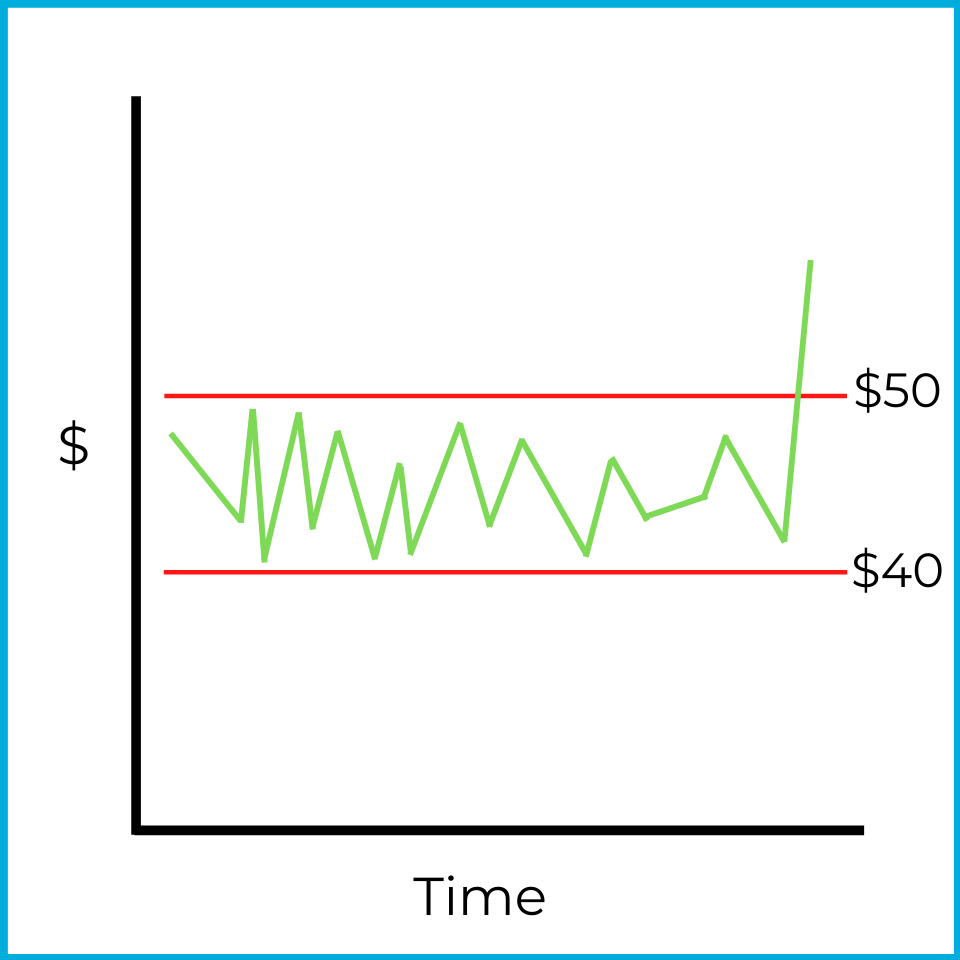
After a breakout, prices often continue moving in the same direction. One explanation is that many investors watch these levels, which can create a self-fulfilling effect. When prices rise above resistance, investors may “jump on the bandwagon,” buy the stock, and push demand (and price) higher. An upside breakout is therefore a bullish indicator.
A downside breakout is the opposite:
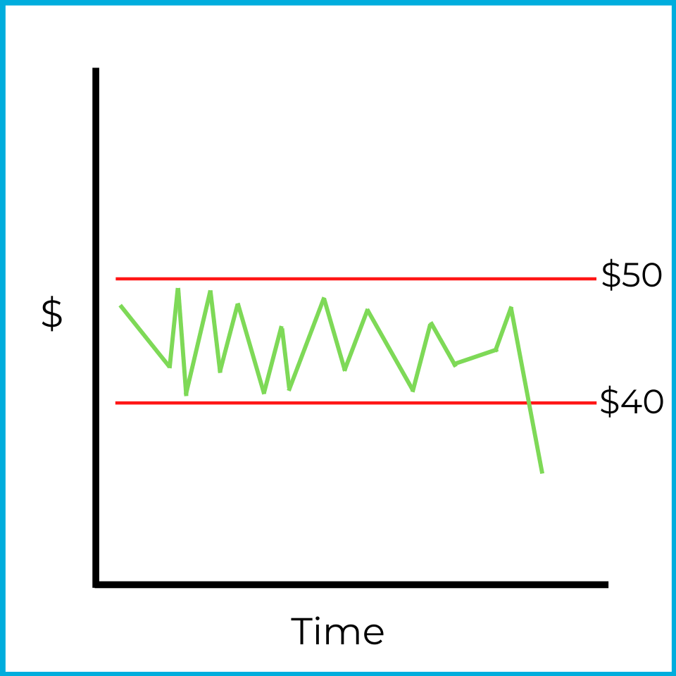
Downside breakouts also tend to continue in the same direction. When prices fall below support, investors may sell to avoid further losses, increasing supply and pushing the price down further. A more aggressive technical analyst might sell short to profit if the decline continues.
In the order types chapter, we’ll discuss what types of orders investors can place to benefit from an upside or downside breakout.
Theories
In general, theories about analyzing and predicting market trends fall under technical analysis. Several theories exist, but you only need to know a few for the exam.
Odd lot theory
The odd lot theory can feel a bit harsh, but it does show up in markets at times. From your SIE studies, you may remember that a round lot is a standardized trading unit, typically 100 shares of stock. Institutions and wealthier investors often trade in round lots because they have more capital and tend to be well-informed. They may buy and sell in blocks of hundreds or thousands of shares.
An odd lot is any amount less than a round lot. If a round lot is typically 100 shares, then buying 37 shares is an odd lot.
There’s nothing inherently wrong with trading odd lots. However, the odd lot theory assumes that less experienced or less informed investors are more likely to trade in odd lots - and that they tend to buy when prices are too high and sell when prices are too low. Under this theory, if you see a strong odd-lot trading pattern, those investors are likely wrong.
A technical analyst who follows the odd lot theory looks for unusual odd-lot activity and then does the opposite. For example, if a chartist sees a large influx of odd-lot sales in a security, they may interpret that as bullish and consider buying.
Short interest theory
Investors can sell short to bet against a security. Short interest measures the percentage of an issuer’s stock that has been sold short. For example, if ABC company’s short interest is 20%, then 20% of its outstanding shares have been borrowed and sold short.
A high short interest might sound bearish, but the short interest theory is counterintuitive. It says that a high level of short interest is a bullish indicator.
The reasoning is that short sellers must eventually buy back the shares to return them to the firm they borrowed from. If short interest is high, a large amount of selling pressure has already occurred and is reflected in the current price. When short sellers later buy to cover, that buying increases demand and can push the price upward.
Under this theory:
- Higher short interest tends to be viewed as more bullish.
- Lower short interest tends to be viewed as more bearish.
Fundamental vs technical analysis
Fundamental and technical analysis are two different approaches to evaluating investments.
Fundamental analysis focuses on what to buy by examining a company’s financial health and economic conditions. Investors look at factors like earnings, revenue, price-to-earnings (P/E) ratio, dividends, and balance sheets to estimate a stock’s intrinsic value. This method is often used by long-term investors who want to find undervalued companies with strong growth potential. For example, an investor might buy a stock because it has consistent earnings growth and a low P/E ratio compared to its industry.
Technical analysis focuses on when to buy by analyzing price trends, charts, and market patterns. It relies on the idea that price patterns can repeat because market behavior tends to repeat over time. This method is mostly used by short-term traders, but it can also be used over longer time horizons to try to capitalize on price fluctuations. For instance, a trader might buy a stock because it has broken above a key resistance level, signaling potential upward momentum.
It’s important to separate the purpose of each method:
- Fundamental analysis helps you decide whether a stock is attractive based on financial and economic data.
- Technical analysis helps you time entries and exits based on trends and patterns.
Many investors combine both approaches.