General test-taking strategies
Don’t be scared
The ACT Science test can look intimidating because it includes lots of scientific terms and unfamiliar topics. In reality, most questions test your ability to read, interpret, and analyze information more than your background science knowledge.
In many cases, you already have everything you need to answer the question. The information is usually in the passage, figure, or table - you just need to locate it and use it.
Italics
Italicized words are a clue that the testmakers don’t expect you to already know the term. When a term is italicized, it’s typically defined immediately after it appears.
- If a word is italicized in the passage, look right next to it for the definition.
- If a word is italicized in the question, the definition will be in the question itself (not in the passage).
Look at the example below and notice how the definition is provided.
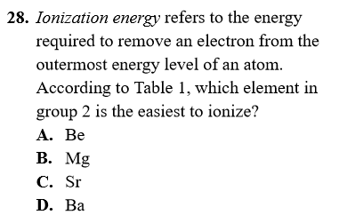
In this example, the term “ionization energy” is italicized and immediately defined within the question. Since it’s italicized in the question, you most likely won’t see that term in the passage.
Annotations
Annotate the questions to understand them more clearly. Learn how to do this effectively by reading the chapter [Time management]. In general, it’s more effective to annotate the questions than the passages.
Skip reading the passages
Start each passage by going straight to the questions instead of reading the passage first. The questions usually point you to specific parts of the passage, table, or figure. By the time you’ve worked through the questions, you’ll have seen the key information from the entire passage.
Guessing
Don’t be afraid to make educated guesses. Just make sure you do this only after you’ve tried to eliminate wrong answers or narrow down the choices.
Use all the info
Use all the information and numbers given in the question. If you notice you haven’t used a number or a key detail, you may be missing an important step.
“Cannot be determined” answers
Always treat answers like “cannot be determined” or “not enough information” as real possibilities. On the ACT, these choices aren’t included just to fill space - they’re sometimes correct.
Use the answers
If you get stuck, look at the answer choices to figure out what the question is really asking you to produce. The choices often reveal what kind of result you should be looking for.
Below is an example of a question that can feel confusing at first, but becomes clearer once you skim the answers.
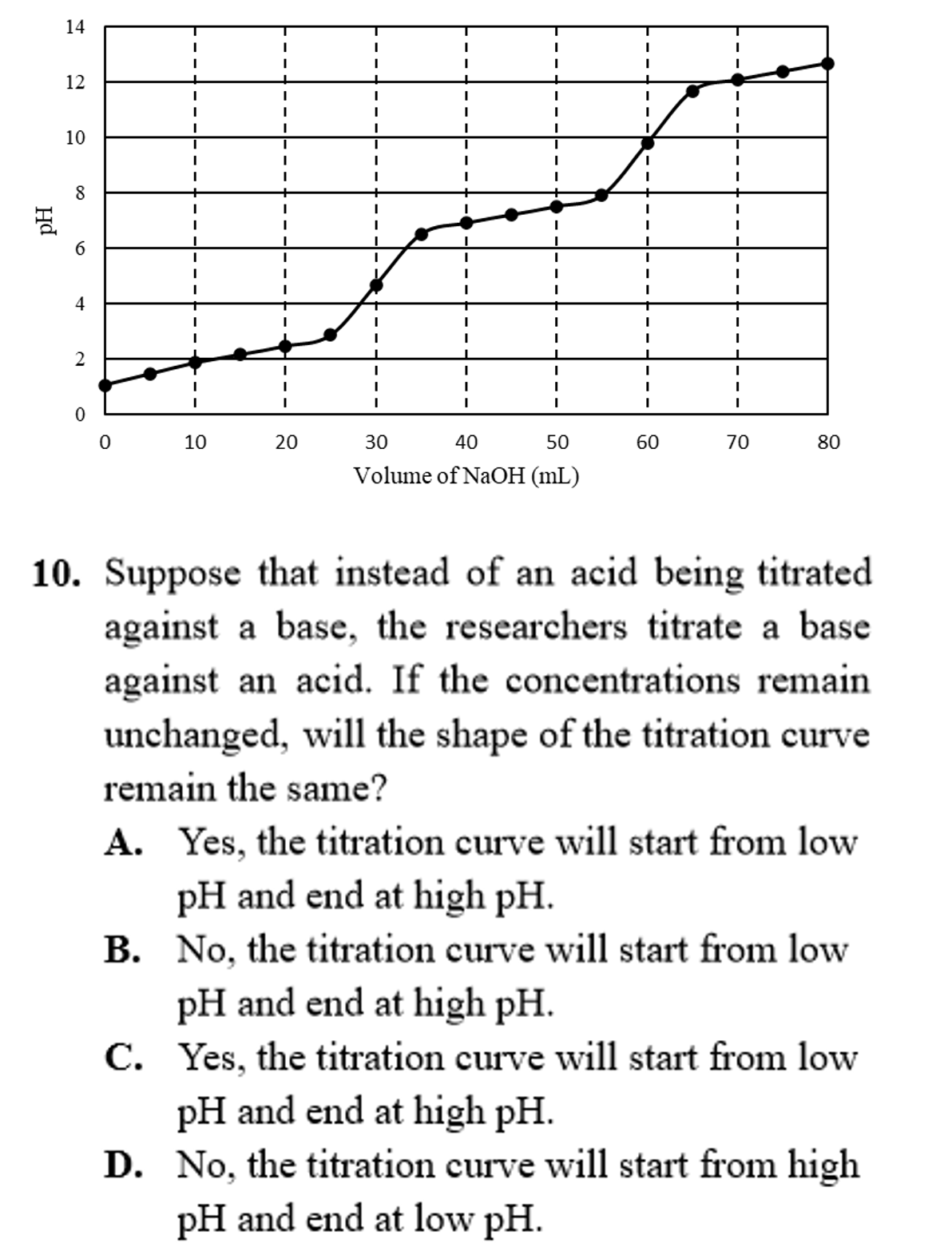
This question asks you to predict whether the graph will change and then explain why. There’s a lot of information in the prompt, but the answer choices show you what to focus on: the y-axis of the graph. This type of question is very common, so expect to see many like it.
Figures
When you look at a graph, start with the axes. When you look at a table, start with the row and column labels. This gives you the meaning of the numbers before you try to interpret the figure.
Look at the example below and consider why many students find this graph difficult.
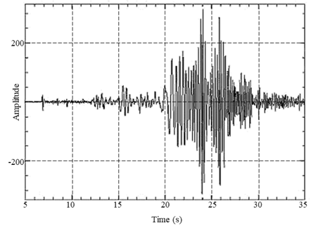
Did you notice that the -axis of this graph is the amplitude? To use the graph correctly, you need to identify that amplitude is the maximum height above or below the midline of a periodic trend. That doesn’t make the graph harder - it just means you have to recognize that definition before answering the question.
Read the axes. That’s the key strategy that turns a “difficult” figure into an easy one.