


Scatterplots and Other Graphs
Introduction
Scatterplots are collections of individual data points shown on a graph. For purposes of the SAT, the shape of a scatterplot will always mirror one of the major types of functions seen on the test: linear, quadratic, or exponential. Of these, linear scatterplots are the most common. This means that everything related to linear equations, particularly their slopes and y-intercepts, arises again as we deal with scatterplots. A good chance to review such a crucial concept as linear equations!
When the shape of a scatterplot graph resembles a line, often a line of best fit is drawn to model the data. This helps the viewer evaluate the general contours of the graph, particularly its slope and intercepts. You will get plenty of practice with the line of best fit in this lesson.
Finally, you will see in this lesson, and in the Achievable practice tests more broadly, the occasional bar graph and line graph. These kinds of graphs are typically familiar to students and need little explanation; like scatterplots, they tend to have - and -axes; understanding what those axes represent and reading them carefully is crucial to solving problems with these sorts of graphs.
Approach Question
Which of the following equations is the most appropriate linear model for the data shown in the scatterplot? A.
B.
C.
D.
Explanation
Why are all the answer choices in slope-intercept form, you may ask? Because, as noted in the introduction, scatterplot questions are typically going to surface again the concept of linear equations. The figure shows a set of points that, as the graph is viewed from left to right, trend generally (though not uniquely) in a downward direction. (Remember that we read graphs, just like English text, left to right.) Imagine that you were to draw a line of best fit for these data. Such a line should start approximately at the point in the upper left and trend downward through the middle of the data, hitting the -axis somewhere between about and .
Clearly, this line of best fit has a negative slope. As we remember as slope-intercept form and note that is the slope, we can eliminate the two answers that have a positive value for (). What would be the -intercept of the line of best fit we imagine here? The good news is that if you use the UnCLES method and consider the answers carefully, you will realize you don’t need to determine that value exactly. Since, of the two remaining answers, one has a positive value and one has a negative, we can confidently choose the one with the positive value because the -intercept is clearly positive. The answer is .
Topics for Cross-Reference
Variations
Although there are no examples of scatterplots in the shape of a parabola in this lesson, this relationship does occur occasionally on the SAT. As long as you remember that parabolas are modeled by quadratic equations and can assess the features of a quadratic function to understand its graph, you will be able to apply the general principles of scatterplot questions to a quadratic model.
Flashcard Fodder
- None here, but use this opportunity to review your flashcards on linear equations, since that concept is vital to most scatterplot questions.
Sample Questions
Difficulty 1
Students at Pleasantville High split up into 10 groups for 10 fundraising carwashes. The bar graph shows the money raised by each of the 10 groups. How many groups raised at least ? (Note: this is a free-response question.)
The answer is 3. To answer this question, we first identify which axis represents the dollar amount raised; in this case, that’s the -axis. Finding on the -axis, we draw our finger across the screen to carefully identify how many of the bars exceed that amount. Groups 4, 7, and 8 raised more than –a total of .
Difficulty 2
A team manager plots Anna Grace’s points scored for each of nine games of the season. The line graph above shows the results. Between which two consecutive games did Anna Grace’s scoring increase the most? A. 1 and 2
B. 3 and 4
C. 4 and 5
D. 6 and 7
The answer is 3 and 4. Reading the slope of the graph’s changes is enough to identify a clear winner. All four of the answer choices represent intervals in which Anna Grace’s scoring went up, but the increase between 3 and 4 is an increase of , whereas none of the other increases are more than .
Difficulty 3
The scatterplot shows the weight of a boy at various ages from 4 to 12, inclusive, along with a line of best fit for the data. At age 11, which is greater: the boy’s actual weight or his predicted weight? A. The boy’s actual weight
B. The boy’s predicted weight
C. The two weights are equal.
D. There is not enough information given to answer the question.
The answer is The boy’s actual weight. This question can be answered quickly; the reason we have labeled it medium difficulty is that, in our experience, students have modest experience with scatterplots and often confuse the actual value with the predicted value. If you remember that the dots present the actual data points that are originally plotted, it will be easier to then recognize that the line of best fit is only a prediction, not a representation of actual values.
At 11 years on the -axis, the dot is above the line. This means the actual value is greater than the predicted value.
Difficulty 4
The scatterplot above shows the number of participants in a soccer program each year from the year the program was started (year 0) to five years later (year 5). What was the average rate of change in participants in the program from year 2 to year 5? A.
B.
C.
D.
The answer is . You may recall from lessons on linear equations and on modeling equations that “rate of change” is a phrase that should immediately conjure the word “slope” in your mind. As long as the relationship described is linear, you can always read the rate of change according to the slope.
But be careful: in this case, we are looking only at the slope from year 2 to year 5. And since the graph displays no single line showing the slope from to , we’ll need to envision our own line. Better (and quicker) yet, let’s use the rise/run formula to evaluate what happens in this interval. The -value at is and the -value at is . This means the two points in view are and . If we subtract for the numerator and for the denominator, we get . (This, by the way, is equivalent to ; another way of describing the rate of change is that, on average, the program’s participant total increased by every year from year 2 to year 5.)
Difficulty 5
The scatterplot above shows the relationship between two variables, and . An equation modeling this relationship can be written as , where and are constants and . Which of the following could be the value of ? A.
B.
C.
D.
The answer is 1.7. To answer this question, we have to think back to the lesson on exponential equations. Look back if you need to! Recall that in the form , is the final amount, is the original amount, and is the independent variable that changes the result (usually this variable is time). What about , the unknown asked about in this situation? To understand what’s happening with , we need to think about when a base is raised to a power greater than .
Consider that, in common parlance, the word “exponential” is typically used to describe accelerating growth over time. There is a good reason for this; when we think of raising a number to a power, we are usually envisioning the power of , , or something larger. But our study of exponents should have reminded you that other powers behave differently: for example, anything raised to the power of stays the same, and anything raised to the power of is .
The graph of an exponential function typically shows accelerating growth from left to right because the graph eventually shows powers greater than , as long as you read far enough to the right. But there is another factor: the base. Not all bases grow as they are raised to higher and higher powers. Thinking about what happens if you keep cutting something in half, over and over again. It certainly isn’t going to get larger! Indeed, if the base is between and , the overall quantity will decrease the larger the exponent gets. This is known as exponential decay and is contrasted with the more common growth function.
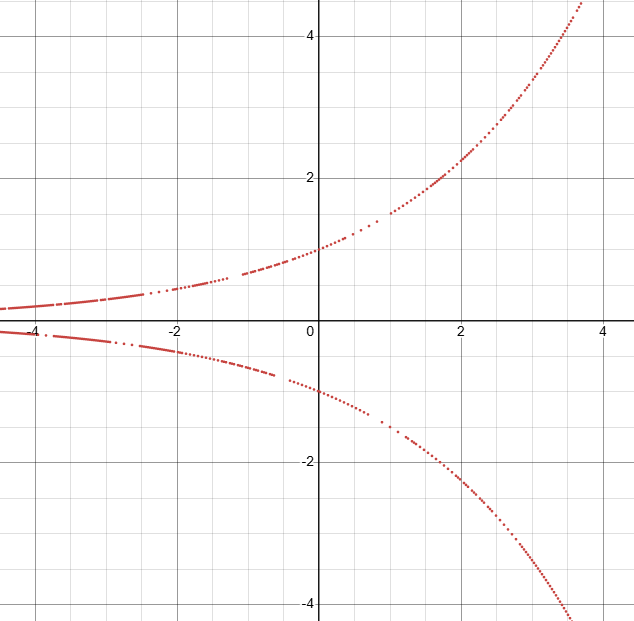
OK, you might be saying, but our graph clearly shows growth in this case. This means we need to avoid decay! We can therefore rule out , which is the only answer choice between and . But there are still three answers left. What happens when you raise to an increasing power? It remains , so its graph would be a horizontal line. Clearly, that’s not what we want. What about the negative base? There’s a reason negative bases are never used in exponential function models; their -values would alternate between negative and positive based on whether the exponent is odd or even. And it’s even more complicated than that if the exponent does not have to be an integer. For the curious: if you graph in Desmos, it doesn’t even connect the points with a curve, which shows how tenuous the graph would be in this case. Here’s a picture of that result:
This leaves our correct answer, . If you already understood that exponential growth can only be represented by a base greater than , you could have skipped the explanation in the previous paragraph. Memorize that simple fact now, and you’ll be able to answer any question like this very quickly!