Understanding and representing data
Types of data
There are two major types of data:
- Categorical (Qualitative): describes qualities or characteristics (e.g., favorite color, type of pet)
- Numerical (Quantitative): measures or counts something (e.g., height, number of siblings)
Knowing the type of data helps you choose a display that matches what the data can - and can’t - show.
Common types of data displays
| Display type | Description | Best used for |
|---|---|---|
| Table | Organizes values in rows and columns | All types of raw data |
| Bar graph | Uses bars to compare frequencies or categories | Categorical data |
| Line graph | Shows trends over time using points connected by lines | Time-based changes in data |
| Circle graph | Also called a pie chart (the more commonly used name), shows parts of a whole | Percentages or proportions |
| Histogram | A bar graph where each bar represents a range (or bin) of values; bars touch with no gaps | Distribution of numerical data |
| Stem-and-leaf | Displays quantitative data in a way that preserves actual data points | Small data sets of numbers |
| Boxplot | Summarizes a dataset using quartiles, median, and outliers | Comparing multiple sets, identifying spread |
| Scatterplot | Plots two numerical variables to show correlation or relationships | Bivariate numerical data |
Choosing the right display
The best display depends on the type of data and what you want the reader to notice.
Example: Categorical data
A teacher surveys students on their favorite ice cream flavor. The results are:
Flavor Students Vanilla 10 Chocolate 8 Strawberry 5 Mint Chip 7 What type of graph best displays this data?
Answer: A bar graph.
A bar graph fits because the data are categories (flavors). Each bar represents one flavor, and the bar height shows how many students chose it. That makes comparisons across categories quick and clear.
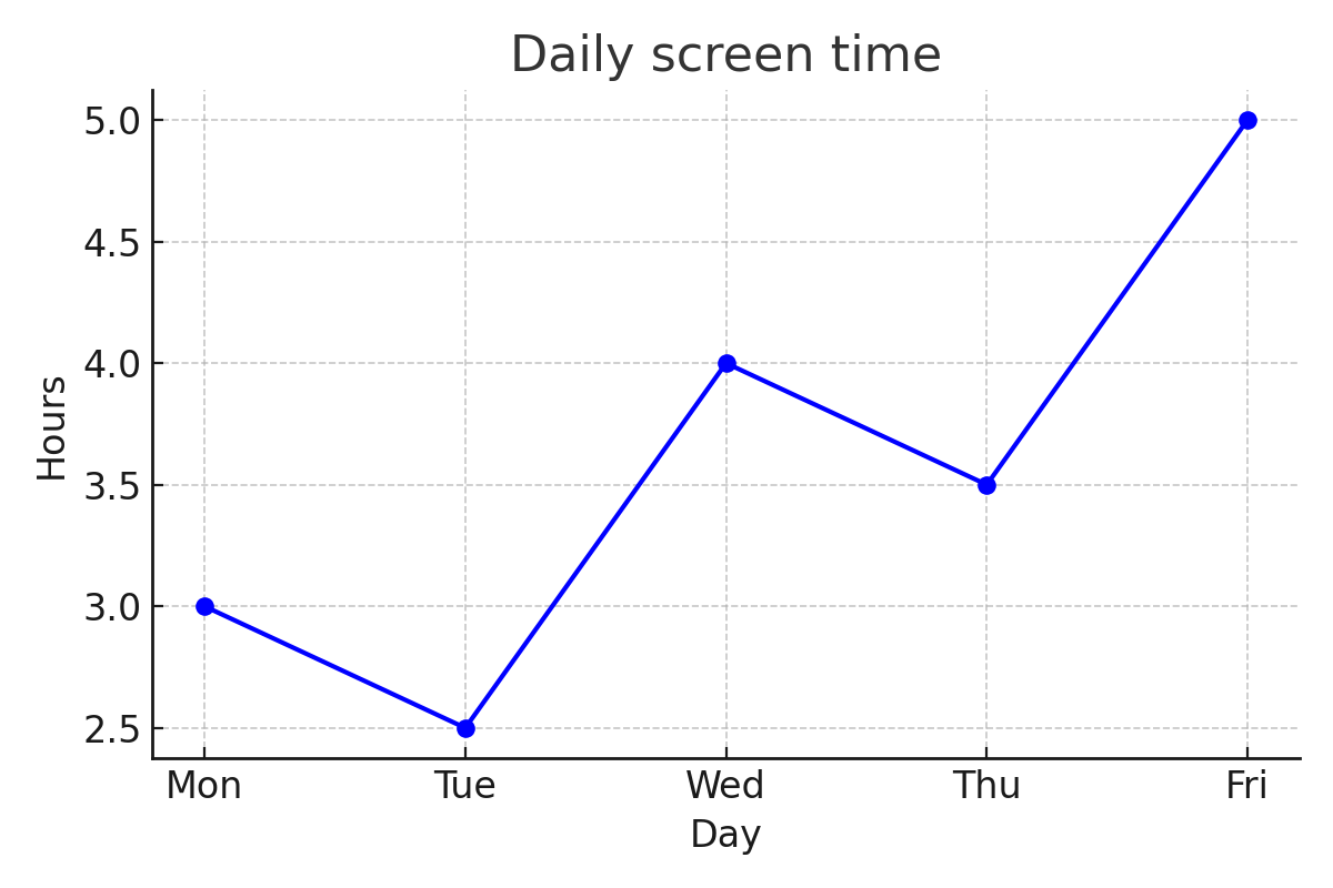
Example: Numerical data over time
A student tracks their daily screen time for a week:
Day Hours Monday 3 Tuesday 2.5 Wednesday 4 Thursday 3.5 Friday 5 What type of graph best displays this data?
Answer: A line graph.
A line graph works well because the data are numerical and ordered by time. Plotting the points and connecting them highlights day-to-day changes and makes overall trends easy to see.
Interpreting visual data
When reading a graph or chart, pay close attention to:
Titles and labels
Explain what the graph represents and what each axis or category means.
Scale
Check whether spacing is consistent and whether units are clearly shown. Be aware that a non-zero baseline or inconsistent axis scaling can make small differences look much larger than they are - always check the scale before drawing conclusions.
Trends
Look for overall increases, decreases, or patterns over time.
Outliers
Identify values that don’t fit the overall pattern, since they can affect averages and interpretations.
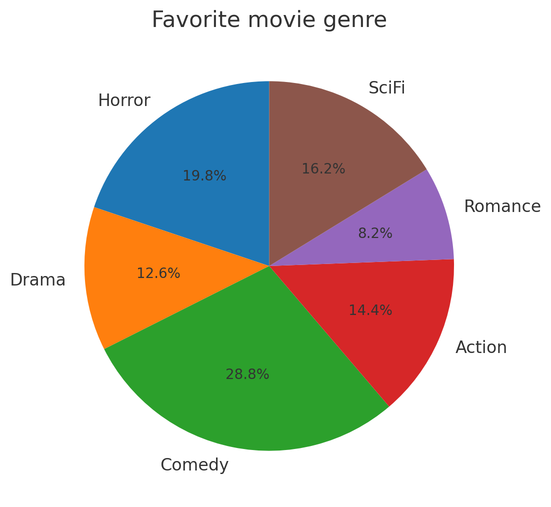
Example: Applications of graphical data
people responded to the survey saying SciFi was their favorite genre. The circle graph below shows the percentage breakdown of responses by genre; the SciFi slice is labeled . Use the circle graph to find the total number of people surveyed.
The circle graph shows that SciFi accounts for of all responses. Since people represent that share, divide to find the total:
Because the displayed percent is rounded, the answer is approximate.
Answer: Approximately people were surveyed.
Interpreting stem-and-leaf plots
A stem-and-leaf plot shows the distribution of a small numerical dataset while keeping the exact data values. The stem contains the leading digit(s), and the leaf contains the final digit of each number.
Example: Reading a stem-and-leaf plot
A stem-and-leaf plot shows quiz scores for a class:
Stem Leaf Key:
- How many students scored in the 70s?
- What is the highest score?
Each row lists the ones digits for all scores with that tens digit. Stem has leaves , , and , so three students scored , , and .
The highest score is the largest leaf on the largest stem: stem , leaf = .
Answer: Three students scored in the 70s. The highest score is .
Interpreting histograms
A histogram looks similar to a bar graph, but it displays the distribution of numerical data grouped into ranges called bins (or intervals). Unlike bar graphs, histogram bars touch each other - there are no gaps - because the bins represent a continuous range of values.
Each bar’s height shows how many data values fall within that bin (the frequency).
Example: Reading a histogram
A histogram shows the number of hours students spent studying for an exam. The bins are: 0-2 hours, 2-4 hours, 4-6 hours, 6-8 hours. The bar heights are 3, 8, 12, 5 respectively.
- Which bin has the most students?
- How many students spent fewer than 4 hours studying?
Read the height of each bar to get the frequency for each bin.
- 0-2 hours: 3 students
- 2-4 hours: 8 students
- 4-6 hours: 12 students
- 6-8 hours: 5 students
The tallest bar is the 4-6 hours bin with 12 students.
For fewer than 4 hours, add the frequencies of the first two bins: .
Answer: The 4-6 hour bin has the most students (12). Eleven students spent fewer than 4 hours studying.
Interpreting boxplots
A boxplot (also called a box-and-whisker plot) summarizes a dataset using five key values:
- Minimum: the smallest value in the dataset
- Q1 (first quartile): the median of the lower half of the data
- Median (Q2): the middle value of the entire dataset
- Q3 (third quartile): the median of the upper half of the data
- Maximum: the largest value in the dataset
The box stretches from Q1 to Q3, and a line inside the box marks the median. The whiskers extend from the box out to the minimum and maximum. The distance from Q1 to Q3 is called the interquartile range (IQR): . Values that fall far outside the whiskers may be flagged as outliers.
Example: Reading a boxplot
A boxplot for student test scores has the following five-number summary: Min = , Q1 = , Median = , Q3 = , Max =
- What is the IQR?
- What percent of students scored between and ?
The IQR is the distance from Q1 to Q3:
The box spans Q1 to Q3, which always contains the middle of the data.
Answer: The IQR is . The middle of students scored between and .
Interpreting scatterplots
Scatterplots show the relationship between two numerical variables by plotting individual data points on a coordinate grid. The -coordinate represents one variable and the -coordinate represents the other. Each point corresponds to one observation.
When interpreting a scatterplot, look for:
- Direction: Does the pattern increase (positive correlation) or decrease (negative correlation)? No clear direction means no correlation.
- Form: Is the relationship roughly linear or curved?
- Strength: Are the points tightly clustered (strong) or widely scattered (weak)?
- Outliers: Are there points far from the overall pattern?
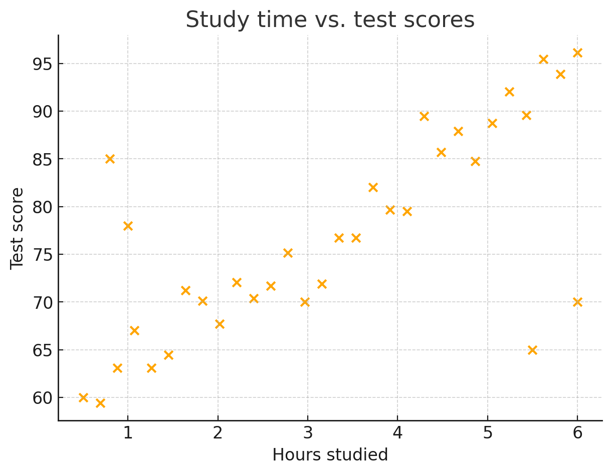
Example: Study time vs. test scores
The scatterplot below shows the relationship between the number of hours students studied and their test scores. Use it to answer the question that follows.
How many students who studied for more than hours received an A (scored above %)?
To answer this question, apply both conditions at the same time:
- Study time greater than hours (points to the right of on the horizontal axis)
- Test scores above (points above on the vertical axis)
Count only the points that satisfy both conditions.
From the scatterplot, there are points that lie to the right of hours and above the score line.
Answer: students studied more than hours and scored above .