

Interpreting scatterplots
When you interpret a scatterplot, start by looking for the overall pattern. The points might:
- trend upward
- trend downward
- form a random cloud
These visual cues help you decide whether a linear relationship might exist and whether tools like correlation or regression would be useful.
In practice, you might use a scatterplot to examine the link between advertising spend and sales revenue to see whether higher budgets are associated with greater revenue. Or you might plot patients’ dosage of a drug against their response level to assess efficacy. Scatterplots can also reveal:
- clusters (subgroups in your data that behave differently)
- outliers (points far from the main pattern, possibly due to measurement error or unusual conditions)
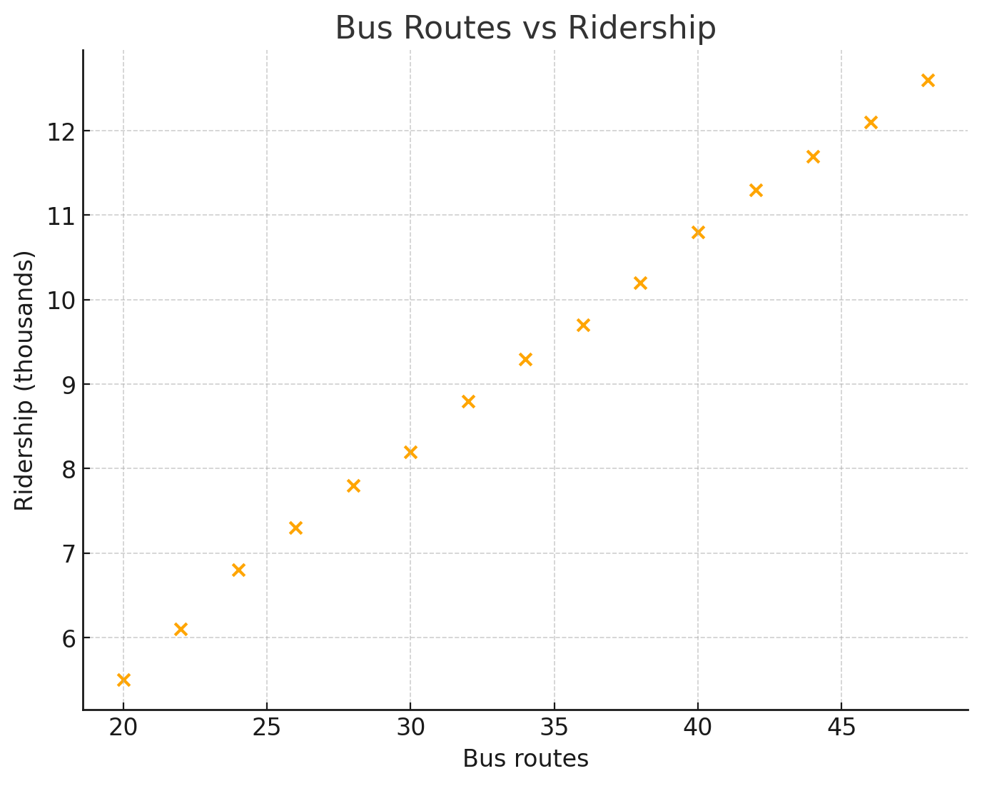
The scatterplot below shows daily bus routes versus ridership across several days. The clear upward trend indicates a strong positive linear relationship: as the number of available routes increases, total ridership increases as well. More routes make public transportation accessible to more people, which tends to increase usage.
Example: Temperature and hot chocolate sales
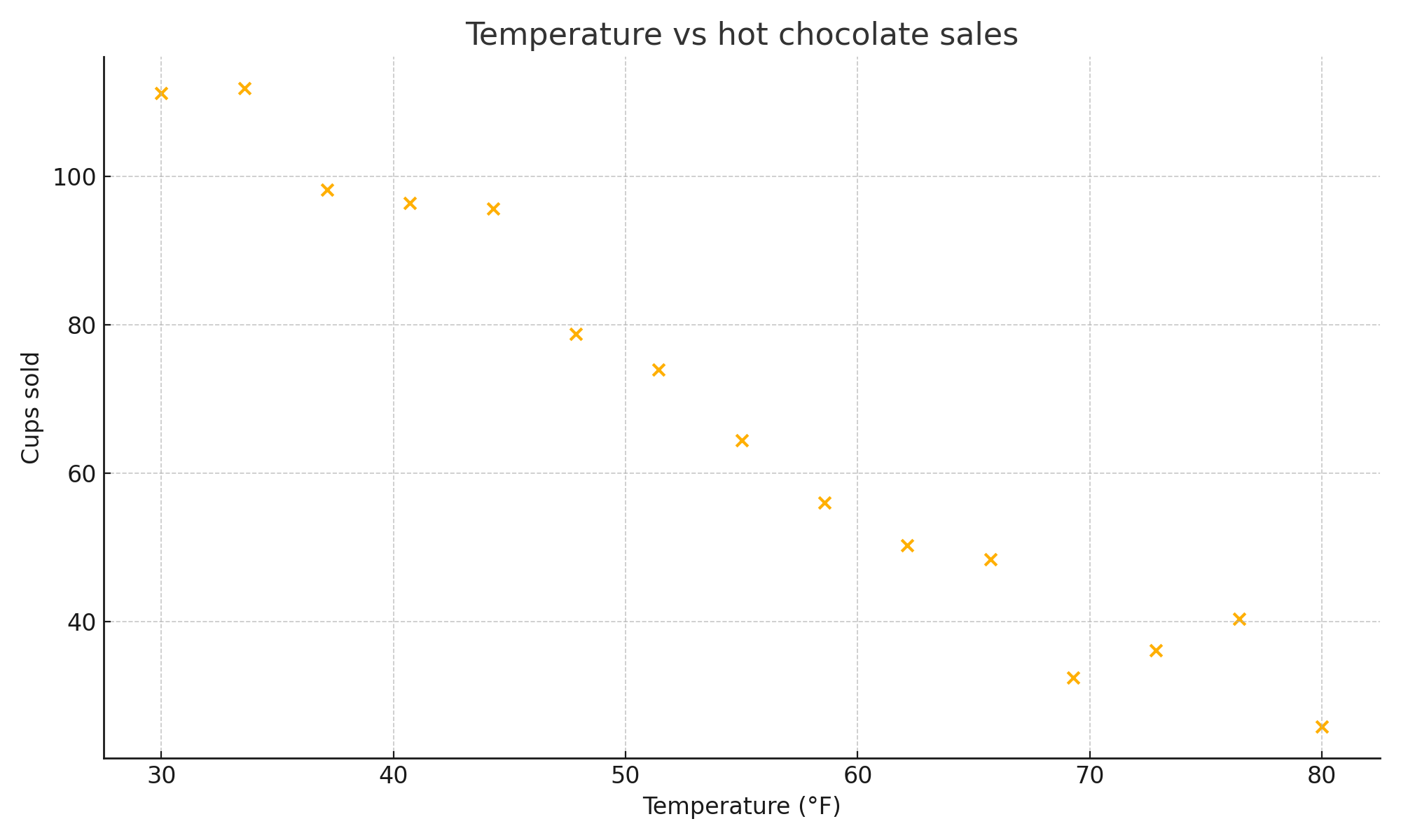
Data for temperature versus hot chocolate sales at a café over several days. As the weather warms up, sales tend to drop, showing a clear negative trend.
Answer the following questions:
- What type of relationship is shown, how can you tell, and what does it mean in context?
- If the temperature rises to 90°F, approximately how many cups of hot chocolate would you expect to sell? Explain your reasoning.
Answer:
-
The scatterplot shows a strong negative correlation between temperature and hot chocolate sales. You can see this from the clear downward trend from left to right. In context, as outdoor temperature increases, hot chocolate sales decrease, which fits the idea that people buy fewer hot drinks in warm weather.
-
90°F is outside the observed range (30-82°F), so any prediction is extrapolation and unreliable - the trend may not continue.
The correlation coefficient r
Scatterplots let you see the direction and rough strength of a relationship visually, but you can also measure it numerically using the correlation coefficient, written as r.
- r ranges from −1 to 1.
- The sign tells you the direction: positive r means a positive (upward) trend; negative r means a negative (downward) trend.
- The magnitude (how far r is from 0) tells you the strength: values near ±1 indicate a strong relationship, values near 0 indicate little or no linear relationship, and values in between indicate moderate strength.
For example, r = 0.91 is a strong positive correlation - the value is close to 1 and the sign is positive. r = −0.65 is a moderate negative correlation. r = 0.07 is essentially no correlation.
Making predictions with a line of best fit
When the points follow a linear pattern, a line of best fit (or trend line) summarizes it. Its equation, usually written , is a model you can use to make predictions.
- Predict: substitute the -value and compute .
- Slope: is the predicted change in for each increase of in , in the units of the context. An increase of in changes the prediction by .
- Intercept: is the predicted when , which means something only if makes sense in the context.
- Residual: the observed value minus the predicted value. A point above the line has a positive residual, and a point below it has a negative one.
Example: using a trend line
For a group of students, the trend line for test score against hours studied is .
(a) Predict the score of a student who studies hours.
(b) By about how much does the predicted score change for each extra hours of study?
(c) A student who studied hours scored . What is the residual?
(spoiler)
- (a)
- (b) The slope is points per hour, so more hours adds about points.
- (c) Predicted score: . Residual: , so the student scored points below the line.
Answer: (a) ; (b) about points higher; (c)
When counts years after a starting year, convert first: if is years after , then is . To find when a quantity crosses a threshold, set the equation equal to the threshold and solve. With , the count reaches when , so : it first drops below nine years after , in . A prediction far outside the range of the data is extrapolation, and the trend may not continue that far.
Caution: correlation does not imply causation
A clear linear trend doesn’t prove that one variable causes the other. A lurking variable (a third factor affecting both variables) or reverse causation can create a correlation that looks meaningful but isn’t causal. With a small sample, a correlation can also arise purely by chance - a single scatterplot is rarely sufficient evidence of a real relationship. Use scatterplots alongside context, subject-matter knowledge, and additional statistical tools.
Example: Correlation versus causation
More firefighters are associated with higher damage costs, and ice cream sales are correlated with drowning rates in summer. What explains these correlations? And in a study where people who exercise regularly tend to have better health outcomes, could the causation run the other way?
Answer: Neither correlation in the first set of examples is causal. Fire severity drives both higher damage costs and the need for more firefighters; warm weather drives both more swimming and more ice cream purchases. These are classic lurking variable examples - the firefighters don’t cause the damage, and ice cream sales don’t cause drownings.
The exercise-health correlation is a reverse causation scenario. People who are already healthier may have more energy and fewer physical limitations, making them more likely to exercise. The data show a correlation, but the direction of cause and effect is ambiguous. Identifying reverse causation requires more than a scatterplot - it typically requires a controlled experiment.
When to use a scatterplot
A scatterplot is the right choice when you have two quantitative (numerical) variables and want to explore the relationship between them. Use a different graph type when:
- One variable is categorical (e.g., comparing test scores across three teaching methods) → use a bar graph or side-by-side boxplot
- You want to show how one variable changes over time → use a line graph
- You want to show the distribution of a single variable → use a histogram or dotplot