Update it, or open this page in a current version of Chrome, Safari, Firefox or Edge. On an iPhone or iPad, update iOS: every browser there runs on the version of Safari that comes with it.
6.3.4.8.3 Business data visualization methods
Achievable CMA Part 1
6. Data analytics
6.3. Types of data analytics
6.3.4. Data visualization
Our CMA Part 1 course is currently in development and is a work-in-progress.
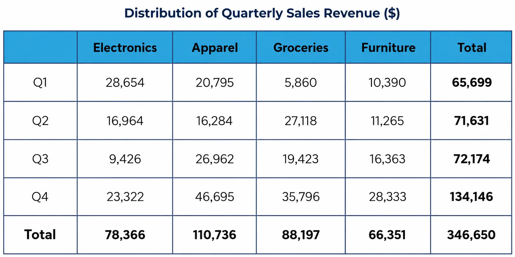
The table below presents the monthly sales figures for five different product categories in a retail store over the past year. The columns represent product categories (e.g., Electronics, Apparel, Groceries and Furniture), while the rows display the quarterly sales revenue for each category. This structured presentation enables a detailed comparison of sales performance across categories and helps identify seasonal trends in product demand.
Quarterly Sales Table
Achievable
6. Bar charts
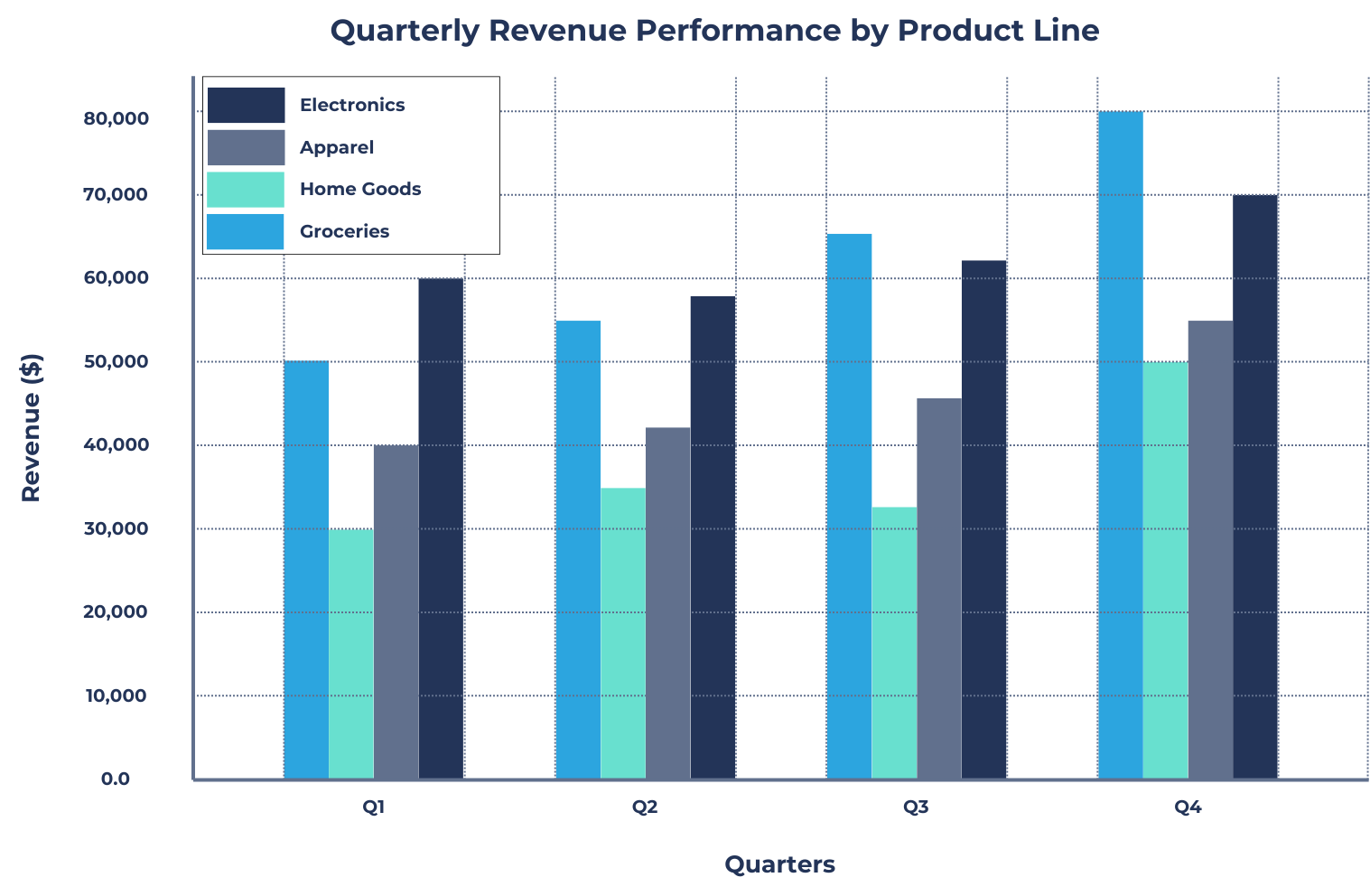
The bar chart below displays the quarterly revenue performance of four product lines (Electronics, Apparel, Home Goods, and Groceries) over the past year. The x-axis represents the quarters (Q1, Q2, Q3, Q4), while the y-axis represents revenue in dollars. Each product category is represented by a different color, allowing for clear comparisons. This visualization helps assess which product lines performed best each quarter and identify seasonal sales trends.
Sample bar chart
7. Pie Charts
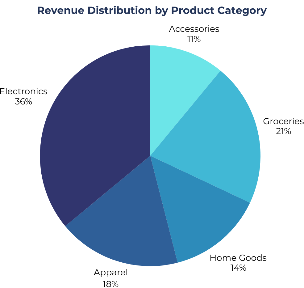
The pie chart below illustrates the revenue distribution of a company’s five product categories (Electronics, Apparel, Home Goods, Groceries, and Accessories) for the past year. Each slice represents the percentage of total revenue generated by each category, with clear labels and color differentiation. This visualization helps in quickly identifying which product category contributes the most to overall sales and where the company’s primary revenue streams originate.
Sample pie chart
8. Line charts
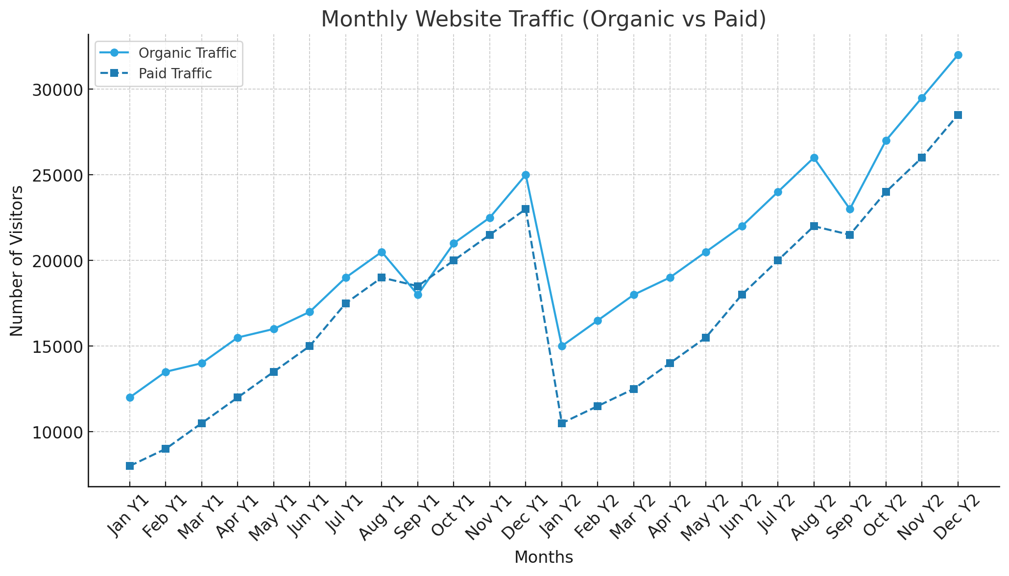
The line chart below depicts the monthly website traffic of an e-commerce store over the past two years. The x-axis represents time (months), while the y-axis represents the number of visitors. The chart includes two lines: one for organic traffic and one for paid advertising traffic. By analyzing this visualization, the business can assess whether its marketing efforts have led to sustained growth and identify any seasonal spikes in website visits.
Sample line chart
9. Bubble charts
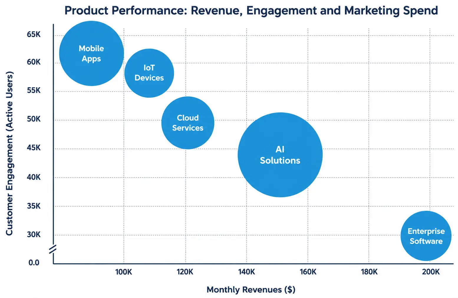
A technology company is evaluating the performance of its different product lines to determine how monthly revenue, customer engagement, and marketing spend interact. By using a bubble chart, the company can visualize these three factors simultaneously, helping analysts identify patterns, trends, and potential areas for improvement. The x-axis represents monthly revenue, the y-axis represents customer engagement (active users per month), and the size of each bubble represents marketing spend. This visualization helps decision-makers assess whether increased marketing investments lead to higher engagement and revenue, as well as compare the relative success of different product categories.
Product Performance Bubble Chart
Achievable
Tables
Present data in rows and columns for precise, multi-dimensional comparison
Best for exact values, structured information, and detailed analysis
Enable users to compare categories, identify patterns, and perform calculations directly
Bar charts
Use rectangular bars to compare categorical data
Effective for comparing groups, showing changes over time, and highlighting disparities
Allow identification of highest/lowest values and trends across categories
Pie charts
Circular charts showing proportions or percentages of a whole
Best for visualizing relative sizes of categories (typically fewer than six)
Help quickly identify dominant or least-represented categories and overall distribution
Line charts
Connect data points over time to show trends and patterns
Ideal for analyzing changes, fluctuations, and seasonality in sequential data
Allow comparison of multiple data series and detection of sudden changes
Bubble charts
Variation of scatter plot displaying three variables (x, y, bubble size)
Useful for comparing relationships among three quantitative variables
Enable identification of correlations, outliers, and clusters in complex datasets
Sign up for free to take 11 quiz questions on this topic
The table below presents the monthly sales figures for five different product categories in a retail store over the past year. The columns represent product categories (e.g., Electronics, Apparel, Groceries and Furniture), while the rows display the quarterly sales revenue for each category. This structured presentation enables a detailed comparison of sales performance across categories and helps identify seasonal trends in product demand.
6. Bar charts
The bar chart below displays the quarterly revenue performance of four product lines (Electronics, Apparel, Home Goods, and Groceries) over the past year. The x-axis represents the quarters (Q1, Q2, Q3, Q4), while the y-axis represents revenue in dollars. Each product category is represented by a different color, allowing for clear comparisons. This visualization helps assess which product lines performed best each quarter and identify seasonal sales trends.
7. Pie Charts
The pie chart below illustrates the revenue distribution of a company’s five product categories (Electronics, Apparel, Home Goods, Groceries, and Accessories) for the past year. Each slice represents the percentage of total revenue generated by each category, with clear labels and color differentiation. This visualization helps in quickly identifying which product category contributes the most to overall sales and where the company’s primary revenue streams originate.
8. Line charts
The line chart below depicts the monthly website traffic of an e-commerce store over the past two years. The x-axis represents time (months), while the y-axis represents the number of visitors. The chart includes two lines: one for organic traffic and one for paid advertising traffic. By analyzing this visualization, the business can assess whether its marketing efforts have led to sustained growth and identify any seasonal spikes in website visits.
9. Bubble charts
A technology company is evaluating the performance of its different product lines to determine how monthly revenue, customer engagement, and marketing spend interact. By using a bubble chart, the company can visualize these three factors simultaneously, helping analysts identify patterns, trends, and potential areas for improvement. The x-axis represents monthly revenue, the y-axis represents customer engagement (active users per month), and the size of each bubble represents marketing spend. This visualization helps decision-makers assess whether increased marketing investments lead to higher engagement and revenue, as well as compare the relative success of different product categories.