Achievable logoAchievable logo
CMA Part 1
Sign in
Sign up
Purchase
Textbook
Practice exams
Support
How it works
Exam catalog
Mountain with a flag at the peak
Textbook
1. External financial reporting decisions
2. Planning, budgeting, and forecasting
3. Performance management
4. Cost management
5. Internal control
6. Technology and analytics
Achievable logoAchievable logo
6.3.4.8.2 Statistical data visualization methods
Achievable CMA Part 1
6. Data analytics
6.3. Types of data analytics
6.3.4. Data visualization
Our CMA Part 1 course is currently in development and is a work-in-progress.

Statistical data visualization methods

8 min read
Font
Discuss
Share
Feedback

Data visualization options

1. Histogram

Definitions
Histogram
A graphical representation of the distribution of numerical data. It consists of contiguous (adjacent) bars that group data into ranges (or bins), allowing for easy visualization of frequency distributions. Unlike bar charts, which display categorical data, histograms are used for continuous data.

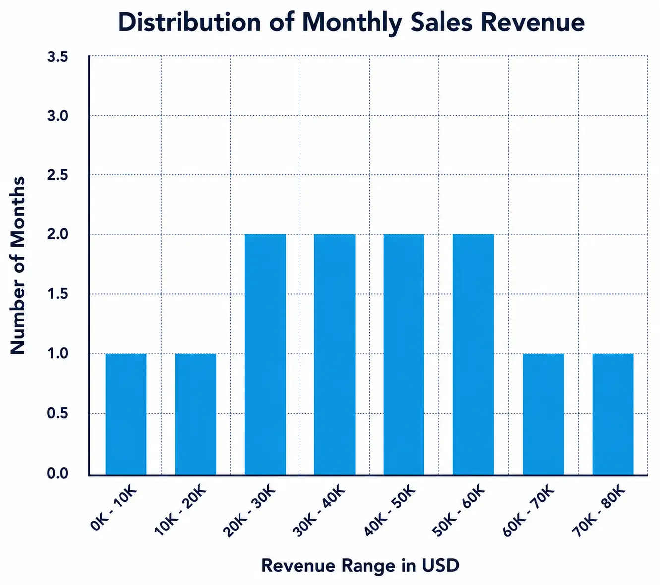
The histogram below illustrates the distribution of monthly sales revenue for a retail store over the past year. The data is grouped into revenue ranges (bins) of USD 10,000 increments, with the frequency represented by the height of the bars. The x-axis represents the ‘Revenue Range in USD’, while the y-axis represents the ‘Number of Months’. This visualization helps in assessing whether sales revenue was consistent throughout the year or experienced significant fluctuations. By analyzing the histogram, trends in revenue performance can be observed, such as the most common revenue range and any periods of exceptionally high or low sales.

Showing the distribution of monthly sales revenue across eight revenue ranges.
Sales Revenue Histogram

When to use histograms

Histograms are best used when analyzing:

  • The distribution of a dataset to understand its shape (e.g., normal, skewed, bimodal).
  • The frequency of values within specific ranges.
  • The presence of outliers or gaps in the data.
  • Variability in data over a period.

Information gathered from histograms

By analyzing a histogram, one can:

  • Determine whether data is evenly distributed or skewed.
  • Identify peaks (modes) in the dataset.
  • Understand the spread and range of the data.
  • Detect anomalies or unusual patterns in frequency distribution.

2. Box plots

Definitions
Box plot (also known as a box-and-whisker plot)
A graphical representation of the distribution of a dataset based on five summary statistics: minimum, first quartile (Q1), median (Q2), third quartile (Q3), and maximum. The plot helps visualize the spread and skewness of numerical data, as well as identify outliers.

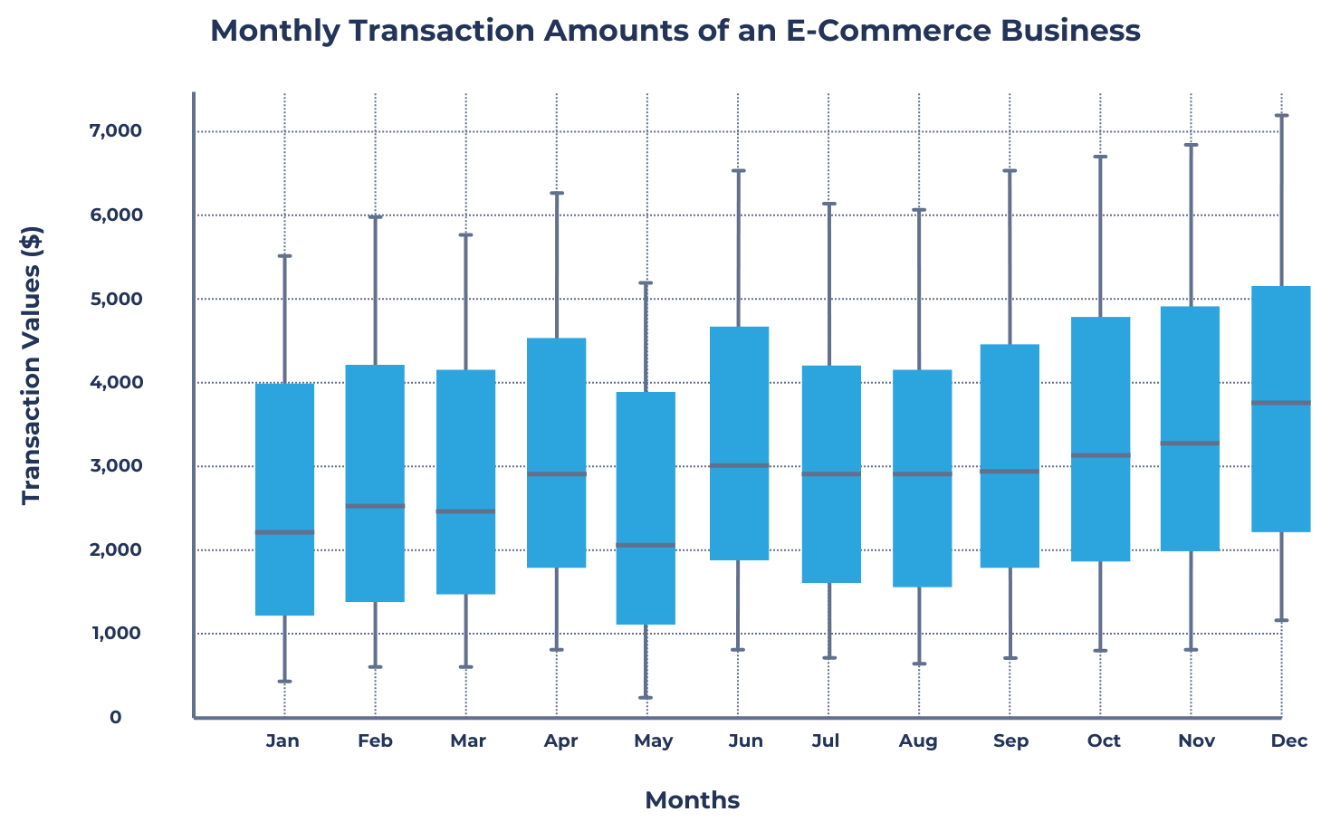
The box plot below illustrates the monthly transaction amounts of an e-commerce business over a year. The x-axis represents different months, while the y-axis represents the transaction values in dollars. The box represents the interquartile range (middle 50% of transactions), the line inside the box marks the median transaction value, and the whiskers extend to the minimum and maximum values, excluding outliers. This visualization helps in assessing which months had the highest variability in transactions and whether any months had unusually high or low transaction values.

Sample box plot
Sample box plot

A few interpretations can be obtained from the box plot above:

  • December’s high transaction values are shown by a higher median and upper quartile, indicating increased consumer spending due to holiday shopping (e.g., Black Friday, Christmas).
  • Wide interquartile ranges (IQRs) in June, October, and November suggest high variability in transaction amounts, often driven by seasonal promotions and major shopping events.
  • Lower median and compact IQRs in January and May indicate lower and more consistent transactions, likely due to post-holiday budget constraints and fewer shopping incentives.
  • Long whiskers in months like October and November reveal a broad range of transaction values, meaning customers spent at very different levels, while shorter whiskers in months like January suggest more stable spending behavior.

When to use box plots

Box plots are best used when analyzing:

  • The distribution of a dataset and identifying its central tendency.
  • The presence of outliers that may affect analysis.
  • The comparison of distributions across multiple categories or groups.
  • The overall spread and variability of data.

Information gathered from box plots

By analyzing a box plot, one can:

  • Identify the median (Q2), which represents the center of the dataset.
  • Understand the interquartile range (IQR) (Q3 - Q1), which measures the middle 50% of data values.
  • Detect outliers, which appear as individual points outside the whiskers.
  • Assess the spread and symmetry of the data; a symmetric box plot suggests normal distribution, while an asymmetric one indicates skewness.

3. Scatter plot

Definitions
Scatter plot
A type of data visualization that represents the relationship between two numerical variables. Each point on the plot corresponds to an observation in the dataset, with one variable plotted along the x-axis and the other along the y-axis. Scatter plots are useful for identifying correlations, trends, and patterns within data.

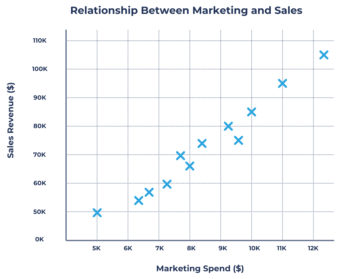
The scatter plot below visualizes the relationship between marketing spending and monthly sales revenue for an online retail store over the past year. Each point represents one month’s data, with the x-axis showing the marketing spend (in dollars) and the y-axis showing the corresponding sales revenue. By analyzing this scatter plot, the company can determine if increased marketing investments lead to higher sales and identify whether any months show unusual deviations from the expected trend.

Sample scatter plot
Sample scatter plot

The scatter plot shows a clear upward trend, indicating a positive correlation between marketing spend and sales revenue. As marketing investment increases, sales revenue also tends to rise. This pattern suggests that higher marketing spending is generally effective in driving more sales.

The relationship appears relatively linear, meaning that each additional dollar spent on marketing leads to a consistent increase in revenue. However, the correlation is not perfect as some months deviate from this trend, suggesting that factors beyond marketing influence sales performance.

When to use scatter plots

Scatter plots are best used when analyzing:

  • The relationship between two numerical variables (e.g., sales revenue vs. advertising expenditure).
  • The presence of positive, negative, or no correlation between variables.
  • Trends, clusters, or outliers in data distribution.
  • The strength and direction of relationships in regression analysis.

Information gathered from scatter plots

By analyzing a scatter plot, one can:

  • Determine if there is a linear or nonlinear relationship between two variables.
  • Identify outliers that do not follow the general trend.
  • Understand whether an increase in one variable leads to an increase or decrease in the other.
  • Recognize data clustering, which can suggest distinct group behaviors.

4. Dot plot

Definitions
Dot plot
A simple data visualization that displays individual data points along a single axis. Each dot represents a single observation, allowing for easy identification of patterns, clusters, and distributions within a dataset. Unlike bar charts or histograms, dot plots do not aggregate data into bins but instead present raw values directly.

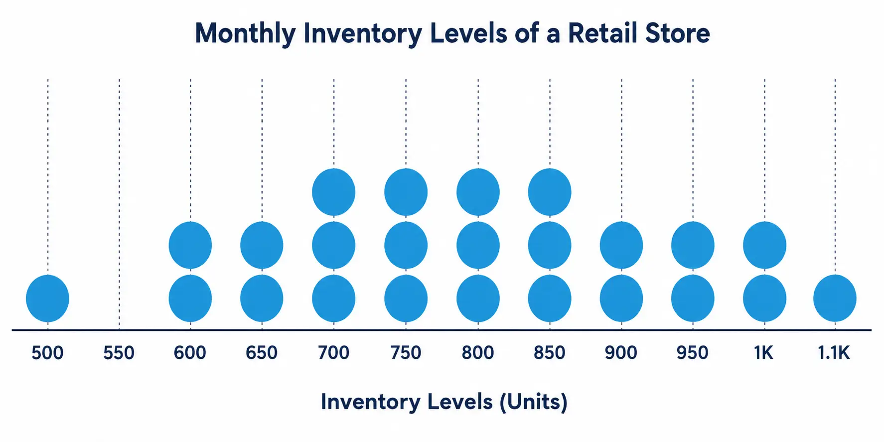
The dot plot below illustrates the monthly inventory levels of a retail store over the past two years. Each of the twenty-four (24) dots represents the inventory count at the end of a given month, plotted along the x-axis, which shows the number of inventory units. By analyzing this visualization, store managers can identify common inventory levels, fluctuations, and potential stock management issues that may impact operations and profitability.

Showing monthly inventory levels of a retail store across different unit ranges.
Inventory Levels Dot Plot

When to use dot plots

Dot plots are best used when:

  • Displaying small to moderately sized datasets where individual values need to be seen.
  • Comparing distributions across multiple categories.
  • Identifying clusters, gaps, and outliers in data.
  • Analyzing frequency of occurrence in categorical or numerical datasets.

Information gathered from dot plots

By analyzing a dot plot, one can:

  • Identify the spread and distribution of a dataset.
  • Detect groupings or clusters in data points.
  • Recognize gaps or inconsistencies in the dataset.

Histogram

  • Visualizes frequency distribution of continuous data using adjacent bars (bins)
  • Reveals data shape (normal, skewed, bimodal), spread, and outliers
  • Best for analyzing variability, common ranges, and trends in large datasets

Box plots

  • Displays five-number summary: minimum, Q1, median (Q2), Q3, maximum
  • Highlights interquartile range (IQR), outliers, and data skewness
  • Useful for comparing distributions and variability across categories

Scatter plot

  • Plots relationship between two numerical variables as individual points
  • Identifies correlation (positive, negative, none), trends, and outliers
  • Assesses strength and direction of relationships; useful in regression analysis

Dot plot

  • Shows individual data points along a single axis (no binning)
  • Ideal for small to moderate datasets to spot clusters, gaps, and outliers
  • Allows direct comparison of raw values and frequency of occurrences

Sign up for free to take 7 quiz questions on this topic

Previous
Next  | 6.3.4.8.3 Business data visualization methods
All rights reserved ©2016 - 2026 Achievable, Inc.

Statistical data visualization methods

Data visualization options

1. Histogram

Definitions
Histogram
A graphical representation of the distribution of numerical data. It consists of contiguous (adjacent) bars that group data into ranges (or bins), allowing for easy visualization of frequency distributions. Unlike bar charts, which display categorical data, histograms are used for continuous data.

The histogram below illustrates the distribution of monthly sales revenue for a retail store over the past year. The data is grouped into revenue ranges (bins) of USD 10,000 increments, with the frequency represented by the height of the bars. The x-axis represents the ‘Revenue Range in USD’, while the y-axis represents the ‘Number of Months’. This visualization helps in assessing whether sales revenue was consistent throughout the year or experienced significant fluctuations. By analyzing the histogram, trends in revenue performance can be observed, such as the most common revenue range and any periods of exceptionally high or low sales.

When to use histograms

Histograms are best used when analyzing:

  • The distribution of a dataset to understand its shape (e.g., normal, skewed, bimodal).
  • The frequency of values within specific ranges.
  • The presence of outliers or gaps in the data.
  • Variability in data over a period.

Information gathered from histograms

By analyzing a histogram, one can:

  • Determine whether data is evenly distributed or skewed.
  • Identify peaks (modes) in the dataset.
  • Understand the spread and range of the data.
  • Detect anomalies or unusual patterns in frequency distribution.

2. Box plots

Definitions
Box plot (also known as a box-and-whisker plot)
A graphical representation of the distribution of a dataset based on five summary statistics: minimum, first quartile (Q1), median (Q2), third quartile (Q3), and maximum. The plot helps visualize the spread and skewness of numerical data, as well as identify outliers.

The box plot below illustrates the monthly transaction amounts of an e-commerce business over a year. The x-axis represents different months, while the y-axis represents the transaction values in dollars. The box represents the interquartile range (middle 50% of transactions), the line inside the box marks the median transaction value, and the whiskers extend to the minimum and maximum values, excluding outliers. This visualization helps in assessing which months had the highest variability in transactions and whether any months had unusually high or low transaction values.

A few interpretations can be obtained from the box plot above:

  • December’s high transaction values are shown by a higher median and upper quartile, indicating increased consumer spending due to holiday shopping (e.g., Black Friday, Christmas).
  • Wide interquartile ranges (IQRs) in June, October, and November suggest high variability in transaction amounts, often driven by seasonal promotions and major shopping events.
  • Lower median and compact IQRs in January and May indicate lower and more consistent transactions, likely due to post-holiday budget constraints and fewer shopping incentives.
  • Long whiskers in months like October and November reveal a broad range of transaction values, meaning customers spent at very different levels, while shorter whiskers in months like January suggest more stable spending behavior.

When to use box plots

Box plots are best used when analyzing:

  • The distribution of a dataset and identifying its central tendency.
  • The presence of outliers that may affect analysis.
  • The comparison of distributions across multiple categories or groups.
  • The overall spread and variability of data.

Information gathered from box plots

By analyzing a box plot, one can:

  • Identify the median (Q2), which represents the center of the dataset.
  • Understand the interquartile range (IQR) (Q3 - Q1), which measures the middle 50% of data values.
  • Detect outliers, which appear as individual points outside the whiskers.
  • Assess the spread and symmetry of the data; a symmetric box plot suggests normal distribution, while an asymmetric one indicates skewness.

3. Scatter plot

Definitions
Scatter plot
A type of data visualization that represents the relationship between two numerical variables. Each point on the plot corresponds to an observation in the dataset, with one variable plotted along the x-axis and the other along the y-axis. Scatter plots are useful for identifying correlations, trends, and patterns within data.

The scatter plot below visualizes the relationship between marketing spending and monthly sales revenue for an online retail store over the past year. Each point represents one month’s data, with the x-axis showing the marketing spend (in dollars) and the y-axis showing the corresponding sales revenue. By analyzing this scatter plot, the company can determine if increased marketing investments lead to higher sales and identify whether any months show unusual deviations from the expected trend.

The scatter plot shows a clear upward trend, indicating a positive correlation between marketing spend and sales revenue. As marketing investment increases, sales revenue also tends to rise. This pattern suggests that higher marketing spending is generally effective in driving more sales.

The relationship appears relatively linear, meaning that each additional dollar spent on marketing leads to a consistent increase in revenue. However, the correlation is not perfect as some months deviate from this trend, suggesting that factors beyond marketing influence sales performance.

When to use scatter plots

Scatter plots are best used when analyzing:

  • The relationship between two numerical variables (e.g., sales revenue vs. advertising expenditure).
  • The presence of positive, negative, or no correlation between variables.
  • Trends, clusters, or outliers in data distribution.
  • The strength and direction of relationships in regression analysis.

Information gathered from scatter plots

By analyzing a scatter plot, one can:

  • Determine if there is a linear or nonlinear relationship between two variables.
  • Identify outliers that do not follow the general trend.
  • Understand whether an increase in one variable leads to an increase or decrease in the other.
  • Recognize data clustering, which can suggest distinct group behaviors.

4. Dot plot

Definitions
Dot plot
A simple data visualization that displays individual data points along a single axis. Each dot represents a single observation, allowing for easy identification of patterns, clusters, and distributions within a dataset. Unlike bar charts or histograms, dot plots do not aggregate data into bins but instead present raw values directly.

The dot plot below illustrates the monthly inventory levels of a retail store over the past two years. Each of the twenty-four (24) dots represents the inventory count at the end of a given month, plotted along the x-axis, which shows the number of inventory units. By analyzing this visualization, store managers can identify common inventory levels, fluctuations, and potential stock management issues that may impact operations and profitability.
When to use dot plots

Dot plots are best used when:

  • Displaying small to moderately sized datasets where individual values need to be seen.
  • Comparing distributions across multiple categories.
  • Identifying clusters, gaps, and outliers in data.
  • Analyzing frequency of occurrence in categorical or numerical datasets.

Information gathered from dot plots

By analyzing a dot plot, one can:

  • Identify the spread and distribution of a dataset.
  • Detect groupings or clusters in data points.
  • Recognize gaps or inconsistencies in the dataset.
Key points

Histogram

  • Visualizes frequency distribution of continuous data using adjacent bars (bins)
  • Reveals data shape (normal, skewed, bimodal), spread, and outliers
  • Best for analyzing variability, common ranges, and trends in large datasets

Box plots

  • Displays five-number summary: minimum, Q1, median (Q2), Q3, maximum
  • Highlights interquartile range (IQR), outliers, and data skewness
  • Useful for comparing distributions and variability across categories

Scatter plot

  • Plots relationship between two numerical variables as individual points
  • Identifies correlation (positive, negative, none), trends, and outliers
  • Assesses strength and direction of relationships; useful in regression analysis

Dot plot

  • Shows individual data points along a single axis (no binning)
  • Ideal for small to moderate datasets to spot clusters, gaps, and outliers
  • Allows direct comparison of raw values and frequency of occurrences

More from Data visualization

  • Benefits and limitations of data visualization
  • Business data visualization methods