Data interpretation
Data analysis questions typically come in groups of two or three. They’re usually in the second half of the question set and are often paired with a chart. Use the same process each time to keep these questions straightforward.
-
Briefly scan the charts to get an overall sense of the data
-
Read the question and identify what information you need
-
Locate the necessary data in the charts
-
Do the math needed to get the answer
-
Reread the question to confirm you answered what was asked, then select your answer
Following these steps helps you turn what can feel like a tricky data interpretation problem into a routine process.
Tip 1: If the charts feel confusing at first, start by reading the first question. A question gives you a specific target, which can make the chart easier to understand. Also, the first question is usually simpler than the others, so it’s a good way to begin exploring the chart.
Tip 2: The most common data interpretation questions ask for either a percentage change or a percent of a whole.
- Percentage change:
- Percent of a whole:
Example data interpretation questions
Let’s work through some data interpretation questions.
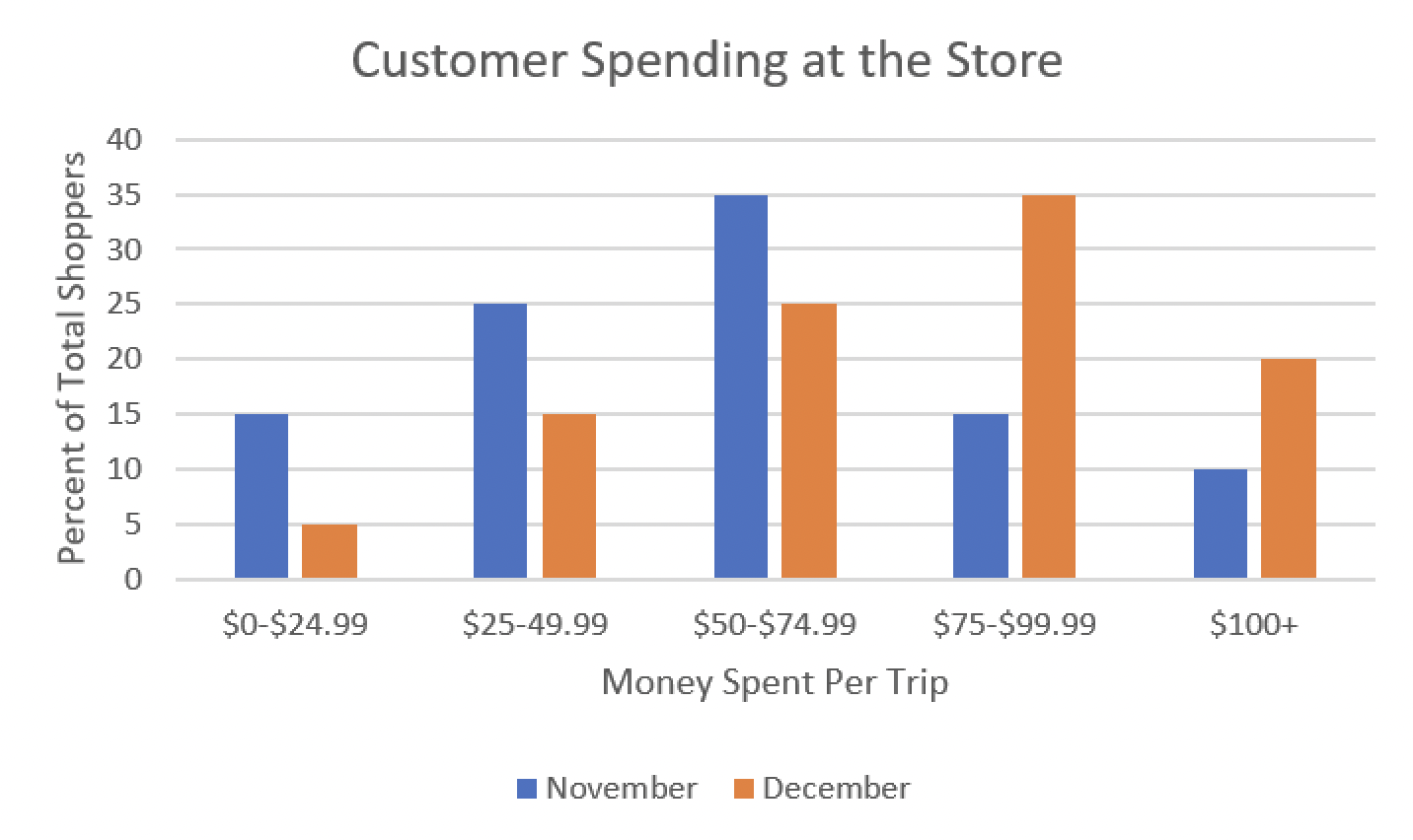
For this question, refer to the figure and chart below.
*The terms trips and shoppers are considered synonymous
Month Total shoppers September 2,000 October 2,200 November 2,400 December 2,500 How many more trips did customers spend $100+ in December than in November?
A. 10
B. 100
C. 250
D. 260
E. 375
Give it a try yourself and check your answer!
Answer: D. 260
In December, there were 2,500 shoppers total. If 20% of those 2,500 spent $100+, that’s:
- ) customers
In November, there were 2,400 shoppers total. If 10% of those 2,400 spent $100+, that’s:
- f) customers
Now subtract to find how many more customers spent $100+ in December than in November:
So, 260 more customers spent $100+ in December than in November.
Data interpretation questions often come in batches. Ready for part 2?
Which of the following must be true?
Choose all correct answers.A. Customers spent more total money in December than they did in September
B. The median customer for both November and December are located in the $50-$74.99 bracket
C. November’s smallest bracket spent more money than December’s smallest bracket
Give it a try!
Answer: C. November’s smallest bracket spent more money than December’s smallest bracket
(No other choices are correct.)
Choice A is incorrect because the total amount spent in September isn’t given. Even if September had fewer customers, you can’t conclude whether the total money spent was less than (or greater than) December’s.
Choice B is incorrect because the median customer is not in the same bracket for both months. The median customer would be in the $75-$99.99 bracket for December and the $50-74.99 bracket for November.
That leaves choice C. To see why it must be true, compare the “smallest bracket” (the bracket with the fewest customers) in each month.
- In December, the smallest bracket has 125 customers.
- In November, the smallest bracket is the $100+ bracket, with 240 customers.
Since November’s smallest bracket has more customers, and those customers are in the $100+ spending category, November’s smallest bracket must have spent more total money than December’s smallest bracket.
Time management for data interpretation questions
Data interpretation questions can be efficient: once you understand the charts, you can often answer several questions quickly. But if the charts are hard to read, these questions can turn into a time sink.
If the charts don’t make sense at a glance, it’s fine to skip these questions and return to them at the end.